01 / Task
Build a premium brand for a new greenhouse manufacturer
TEPLOGARDEN commissioned a complete branding project from scratch. The goal was to elevate the product from a utilitarian greenhouse to an architectural garden object: reliable, technologically advanced, aesthetically pleasing, and relatable to the buyer of a country home.
Initial situation
There is a product, but no brand.
The client had its own production facility, a high-tech product, and expertise. They lacked a name, a recognizable image, or a unified customer communication system.
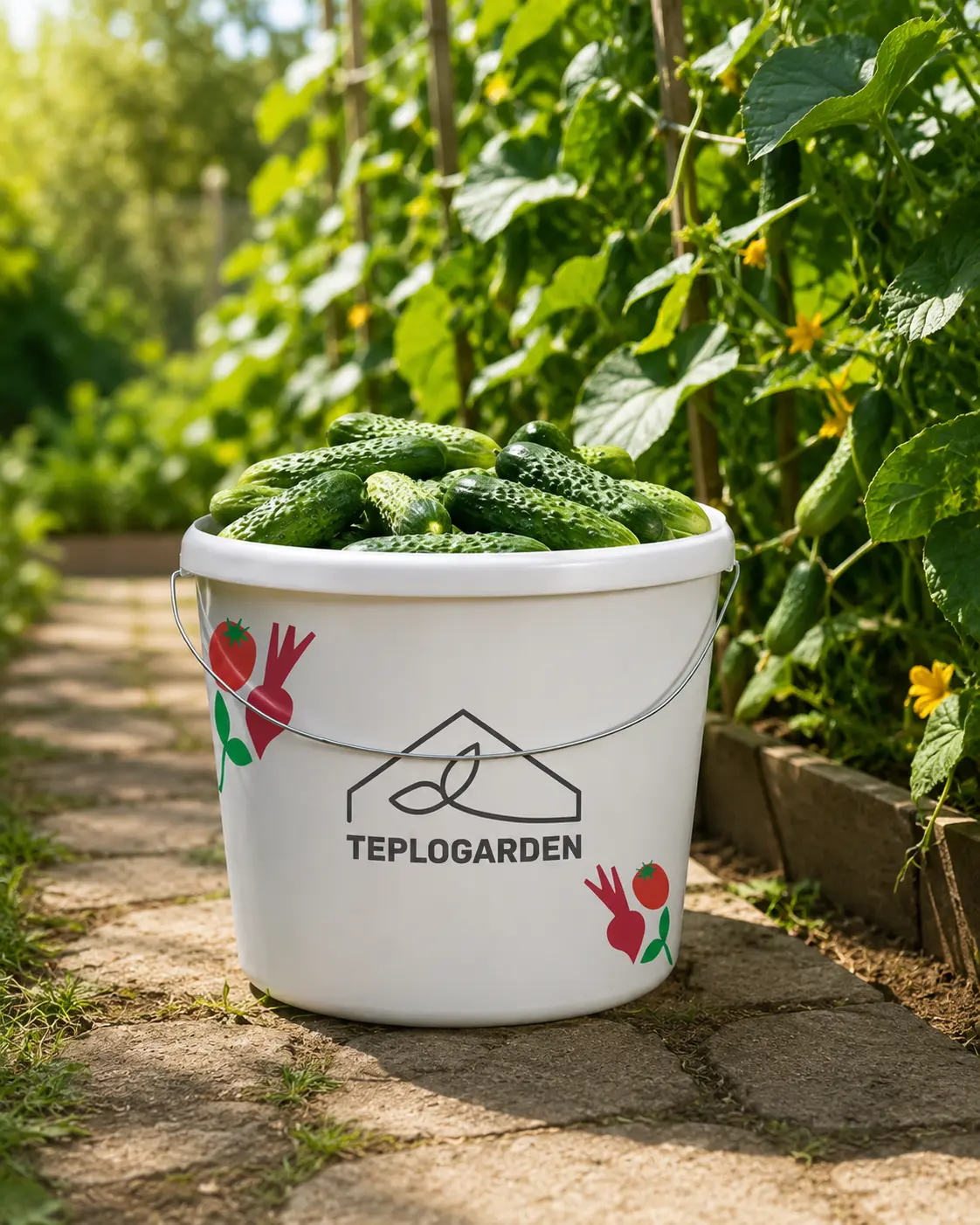
Key challenge
Technology and garden aesthetics
The greenhouse was not meant to be perceived as a temporary utility structure, but as a durable and aesthetically pleasing part of the site's architecture.
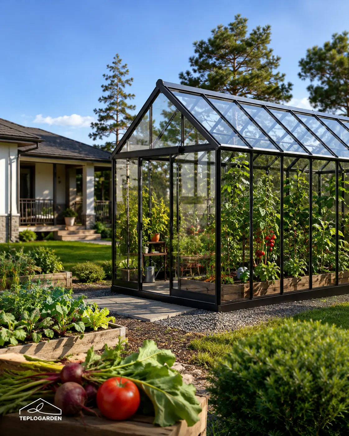
Solution
Brand system from logo to website
The brand combined positioning, name, identity, and key promotional and sales materials—from the catalog and presentation to the website.
02 / Positioning
Not just a greenhouse, but architecture for the garden and harvest
The brand combined positioning, name, identity, and key promotional and sales materials—from the catalog and presentation to the website.
«"TEPLOGARDEN is a premium greenhouse that looks like part of the garden, works like technology, and is sold as a complete solution."»
The brand book describes the product as the production and sale of innovative, modern greenhouses with delivery. Communication reinforces key benefits: reliable design, optimal conditions for plant growth, resource savings, professional consulting, and a personalized approach.

Brand model
360°
The system covers all key touchpoints: logo, brand elements, printing, digital media, website, presentation, and merchandise.
Ruler
3 episodes
The names of the greenhouses are arranged in a single architecture: TEPLOSEASON, TEPLOCULTURE and TEPLOGRAND.
Communication
always in season
The slogan translates the technical advantage into a clear consumer image: growing and gardening are not limited by the weather.
CA 01
Owners of country houses
Buyers who want a greenhouse to be an aesthetically pleasing addition to their property and complement their home, landscape, and lifestyle.
CA 02
Gardeners and hobby growers
An audience that values yield, reliability, season extension, easy-to-understand care, and consulting support.
CA 03
Landscape designers
Professionals who require a visually appealing product for inclusion in garden, patio and outdoor projects.
CA 04
Developers and villages
Partners interested in standard solutions for cottage communities, show lots, and premium area development.
CA 05
Wholesale customers
Buyers who value a comprehensive product line, delivery terms, a clear catalog, standardized documentation, and a reliable manufacturer.
03 / Working on the brand
From a semantic platform to ready-made media
The brand has consolidated its positioning, identity, and key launch materials. This unified system helps clearly present the product, define the product line, and support sales across all channels.
Stage 01
Positioning
A technological greenhouse as an aesthetic part of country architecture, and not a utility structure.
Stage 02
Logo
The recognizable symbol combined the silhouette of a greenhouse and a sprout and became the basis for brand identification.
Stage 03
Visual code
The palette, typography, and graphics established a unified brand image across all communication channels.
Stage 04
Sales materials
The website, catalog, presentation, and social media formed a unified system for attracting and supporting clients.
04 / Identity system
Visual system for recognition and sales
The identity combines the greenhouse's architecture, natural motifs, and the product's technological advancement. Unified rules allow for consistent design of the website, advertising, documents, and sales materials.
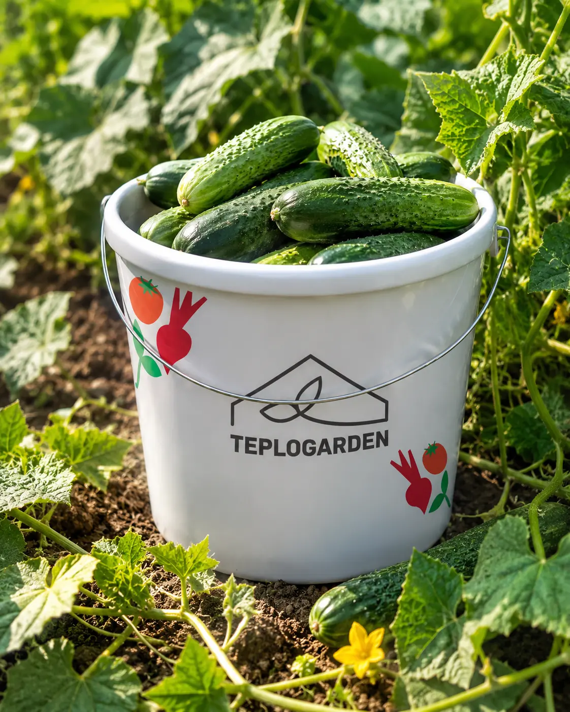
01 / logo
Recognizable sign
The greenhouse silhouette and sprout create a simple image that is easily recognized on websites, documents, packaging, and advertising.
02 / typography
Clear hierarchy
Contrasting headings and a calm set font make the materials clear and easy to read.
03 / graphics
Signature accents
Natural shapes and vibrant colours distinguish the brand and make communications more vibrant and recognizable.
04 / rules
Single
approach
A brand book records the use of the logo, colors, and graphics to ensure the brand remains consistent across all channels.
05 / Brand book fragments
A system for launching and developing a brand
A brand book establishes identity rules and their application across key channels. The team and contractors can release materials more quickly while maintaining a consistent brand image.
TEPLOGARDEN / brandbook
Brandbook
Uniform rules
for brand and sales
for brand and sales
The logo, colors, fonts, and graphics are all integrated into a single system. This simplifies working with contractors and reduces errors during brand implementation.
Sales
Tools for
promotion and sales
promotion and sales
The website, catalog, presentation, and social media are designed in a unified manner. These materials help clearly present the product line and lead customers to the final order.
06 / Color and Tone
A palette of garden, harvest, and premium purity
The color scheme is built on a natural base: deep green and green represent trust and growth, beige creates a soft, premium background, red and pink-burgundy add harvest accents, and gray maintains technology and legibility.
Deep Green
#518257
Green
#4CA750
Rad
#C56354
Rad Pink
#9B384D
Beige
#F7F7EF
07 / Media
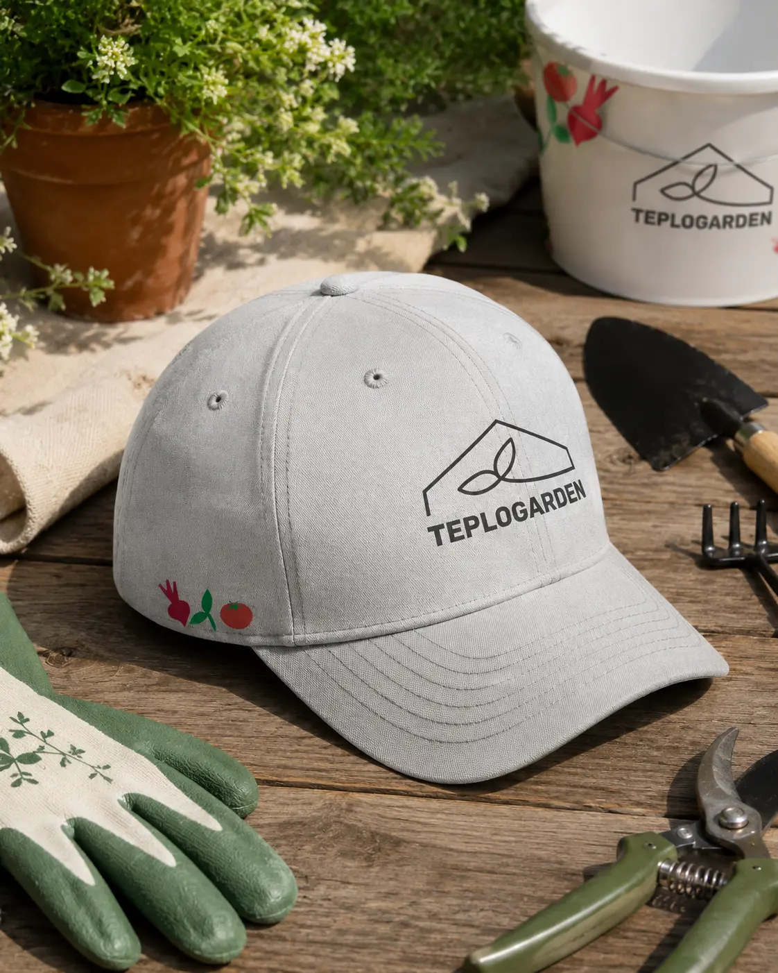
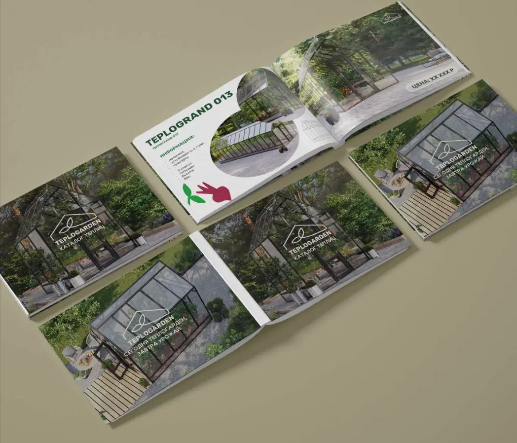
The brand works in digital, print and product presentations
The identity was immediately broken down into tangible touchpoints. This is crucial for a new manufacturer: customers must see a consistent brand across advertising, social media, the catalog, documents, the website, and product presentations.
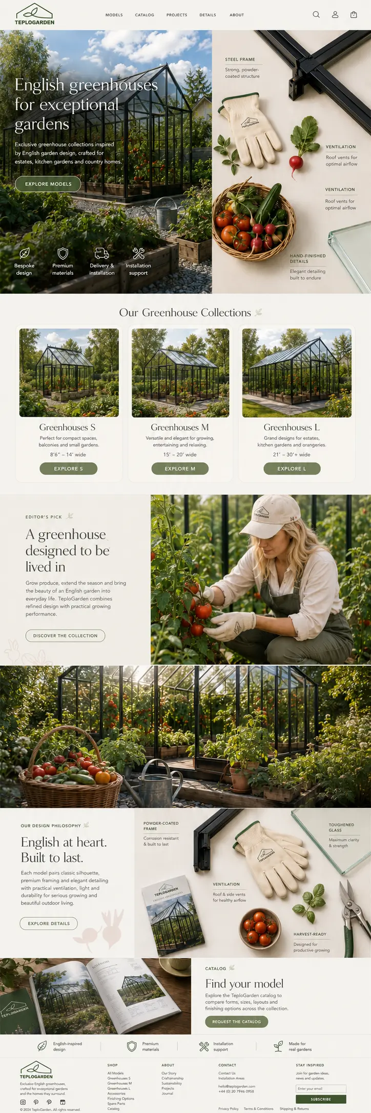
Website
Carriers of the lifestyle script
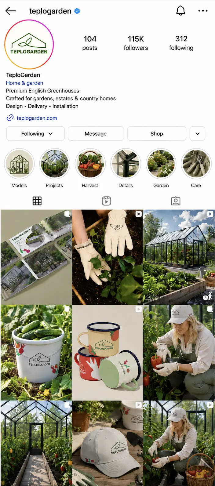
SMM
garden aesthetics
MERCH
Carriers of the lifestyle script
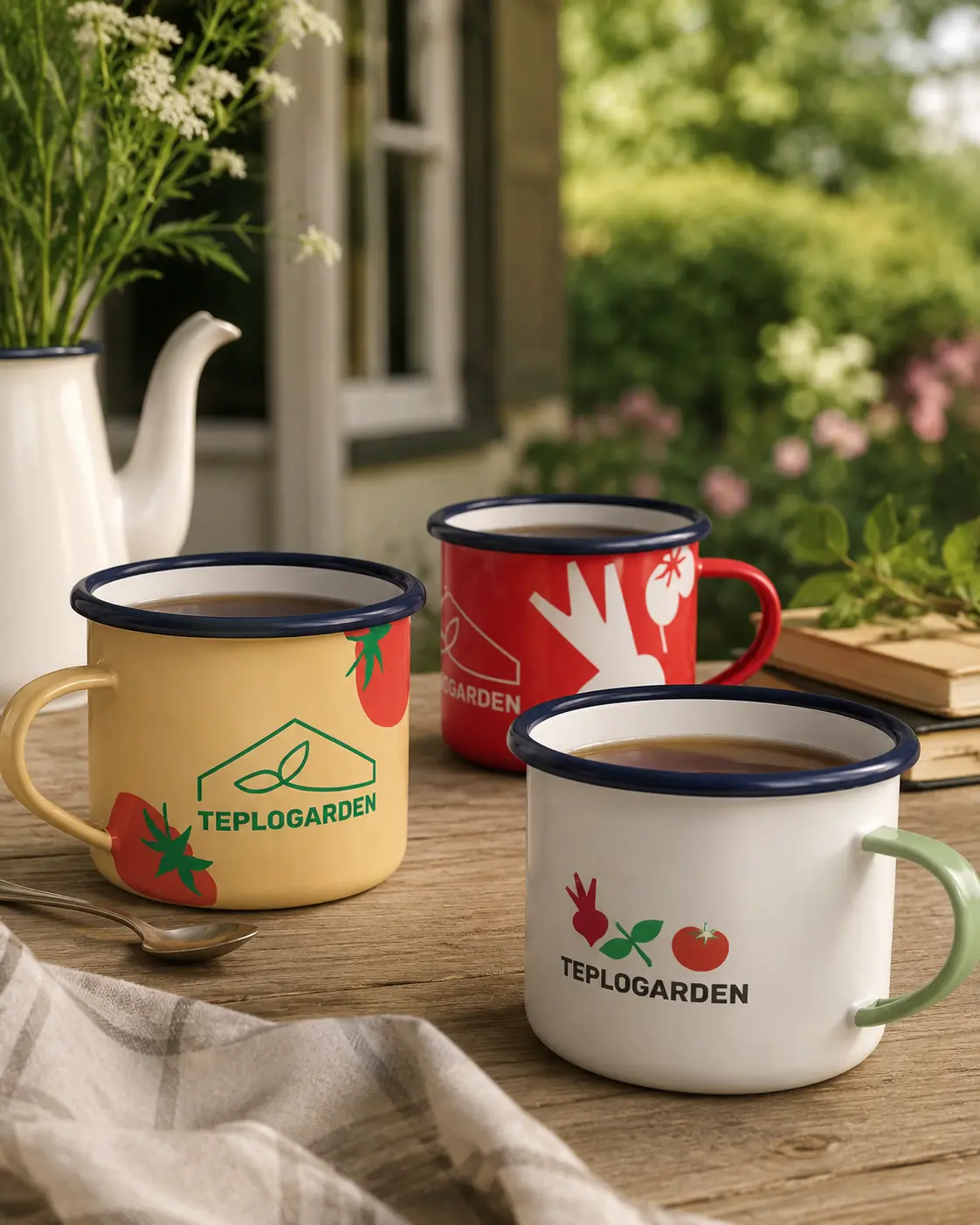
AESTHETICS
authenticity
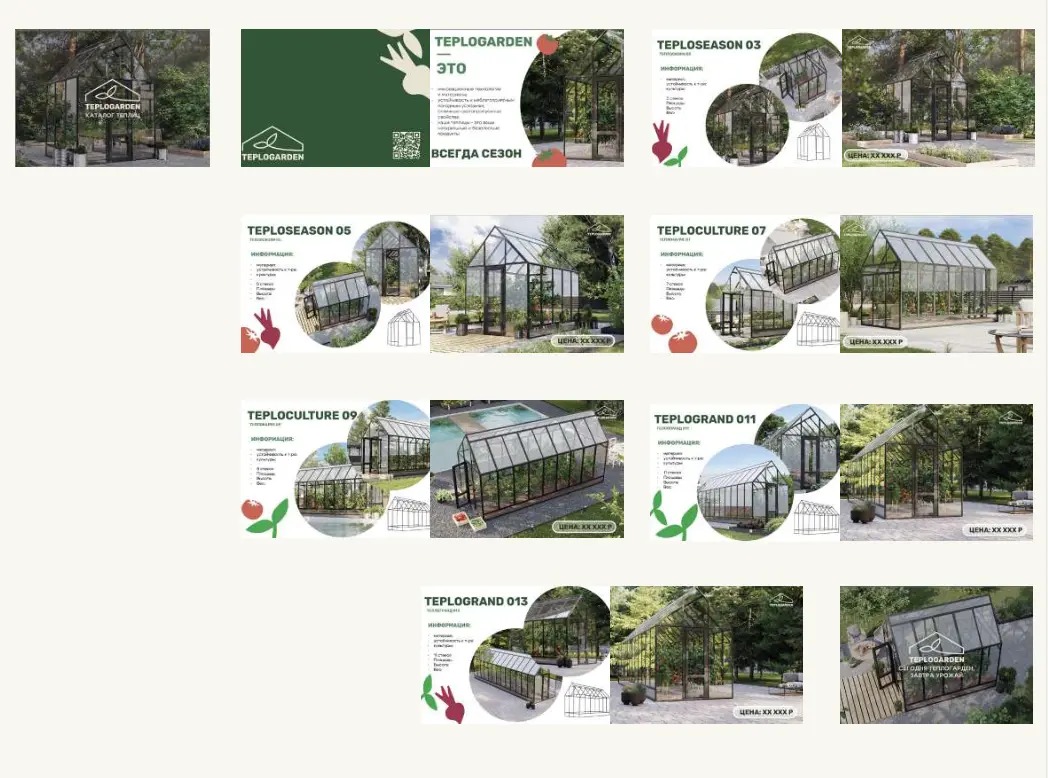
CATALOG
sales materials
MERCH
pleasant routine
08 / Result
The brand is ready to enter the market
TEPLOGARDEN now has a unified system for its launch: positioning, identity, brand guidelines, and promotional and sales materials.
Identity
Recognizable brand image
The visual system distinguishes TEPLOGARDEN from other utilitarian greenhouses and supports the premium positioning of the product.
Brandbook
Scaling system
A brand book simplifies the work of the team and contractors and helps maintain a consistent brand image across all channels.
Sales materials
Ready-made sales tools
The website, catalog, presentation, and social media clearly present the product line and help convert customer interest into a request.
TEPLOGARDEN received a clear market positioning and a ready-made sales system. The greenhouse began to be perceived as a fully-fledged part of the country's architecture, rather than just a utility structure.
Ready to grow?
Let's discuss the budget, timeframe, and what really works here and now.
Leave a request - I will review the task and suggest a work format