We needed to create a brand that looks like an object of desire, but remains understandable in daily care.
Мы рассматривали косметический бренд не только как упаковку, а как систему: аудитория, обещание, линейка, визуальный код, tone of voice, презентация и маркетинговая логика запуска.
02 / Brand platform
We built the brand around contrast: naturalness, the energy of color, and technological purity.
The platform had to strike a balance between the emotional appeal of Gen Z and the trustworthiness of the product in the personal care category: purity of formulas, clear benefits, visual expressiveness, and the feel of an international brand.
01 / Audience
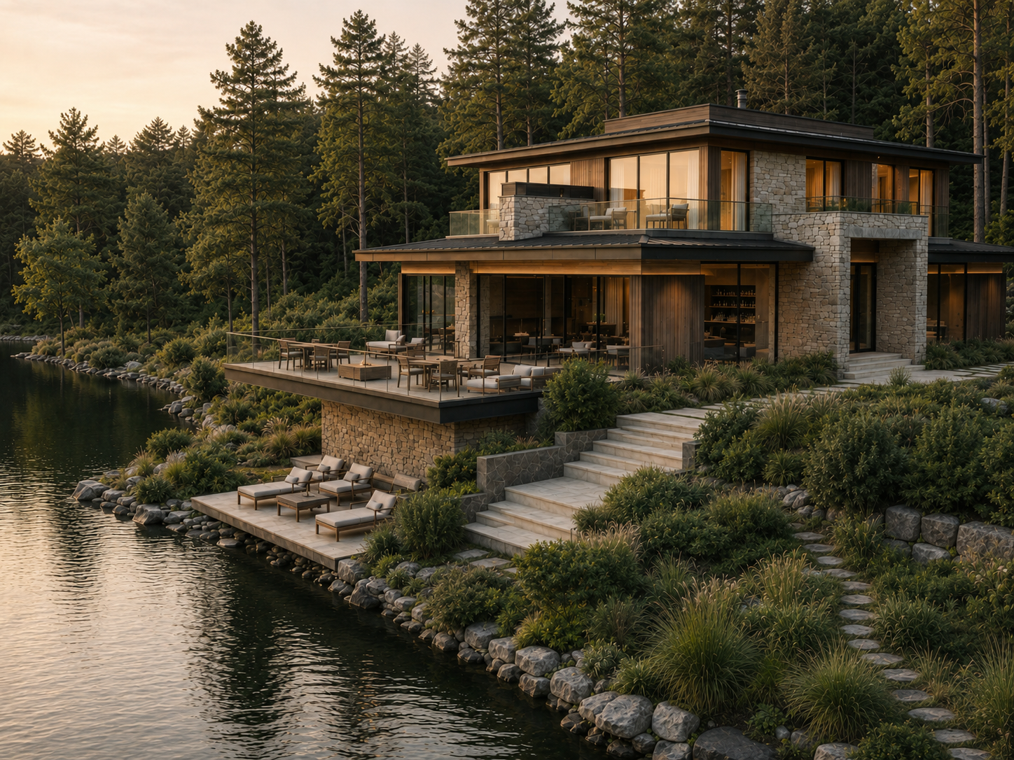
Редкий формат уединённого велнес-ретрит
Небольшой по масштабу объект с приватным сервисом, глубокой средой и персональным уровнем внимания.
02 / Promise
Состоятельные гости, ценящие тишину, эстетику и восстановление
Предприниматели, пары, частные гости и аудитория с запросом на неспешную роскошь и качественную природную среду рядом с Москвой.
03 / Positioning
Архитектура, сервис и природный контекст работают как единый сценарий пребывания
Гость получает не только проживание, но и сценарий пребывания: от прибытия до вечернего ритуала у воды.
04 / Tone
Повышение статуса, узнаваемости и воспринимаемой ценности
Брендирование и концептуальная упаковка усиливают дифференциацию, помогают капитализировать объект и удерживать премиальный ценовой уровень.
Why is that?
Категории ухода нужен быстрый считываемый образ: продукт должен работать и как косметика, и как визуальный объект.
Color blocking
Memorability on the shelf, in the marketplace, and in social media.
Clean labels
Premium simplicity, trust and product transparency.
Benefit naming
Clear logic of the line without complex terminology.
Routine logic
A system that can be easily scaled to new SKUs.
Marketing logic
We determined how the brand would explain itself to the customer and scale its communications
The marketing component included an analysis of strengths and weaknesses, product architecture, semantic zones, and principles of brand presentation in presentations, digital channels, and commercial materials.
Market entry
Launch through strong visual code and simple product benefits
At the start, a brand doesn't need overloaded expertise, but rather a quick explanation: what it is, who it's for, what effect it has, and why people want to pick it up.
Brand strengths
Brightness, internationality, flexibility of the line, photogenicity
These benefits are embedded into the communication and visual language to ensure the brand works across presentations, cards, content, and offline materials.
Risks to control
Don't fall into naivety and maintain a premium level
Visual expression is balanced by minimalist typography, a neat grid, clean packaging solutions and a clear hierarchy.

Tuscan Morning packaging
Olive palette of the resort series
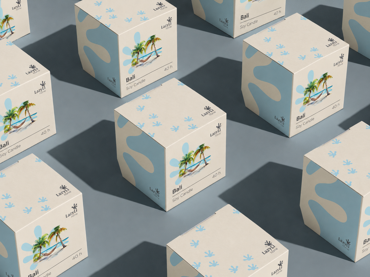
Bali Resort packaging
Warm resort visual code
Concept developing
Что делали в рамках разработки концепции
Работа была выстроена как запуск бренда с нуля: сначала смысловая и рыночная база, затем визуальная логика, после этого — презентационная структура и материалы для продвижения.
01
Category analysis
We studied the visual and product codes of youth cosmetics to find the space between mass-market and premium care.
02
Positioning
We formulated the brand's role, value proposition, tone, and key messages for the audience.
03
Design direction
We defined the principles of the visual system: bright color, clean typography, packaging logic, and digital-ready compositions.
03
Brand guide
We compiled rules for further work: palette, media, composition, product blocks, and presentation.
Brand guide
Заложили систему, в которую можно вставлять визуалы, упаковку, продуктовые рендеры и слайды.
HTML оставлен без изображений: визуальные зоны оформлены как чистые плейсхолдеры, чтобы дальше можно было вставить итоговые кадры, упаковку, PDF-развороты и презентационные изображения.
Design principles
Премиальность держится не за счет сдержанности, а за счет дисциплины системы.
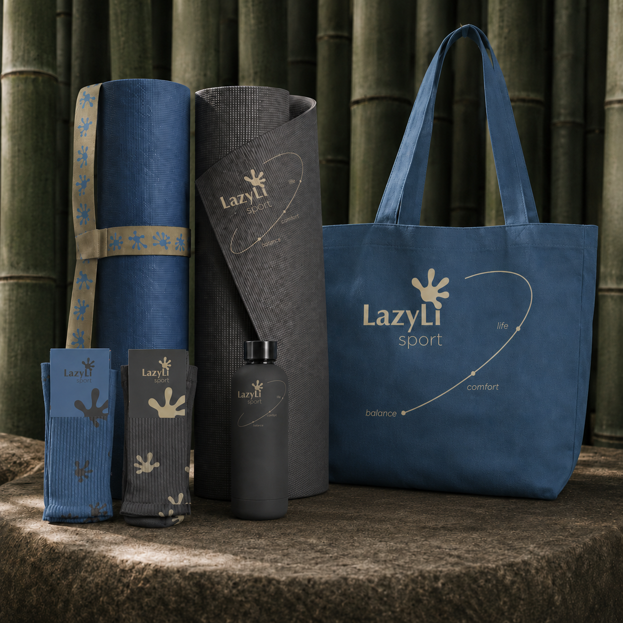
Bright palette
Colour functions as a key brand marker, but is used within a clear compositional logic.
Clean typography
A simple hierarchy makes packaging and communications clear, modern and uncluttered.
Scalable grid
The system is applicable to tubes, jars, bottles, marketplaces, presentations, and digital content.
Product-first storytelling
Each SKU is explained through effect, texture, ritual of use and emotional state.
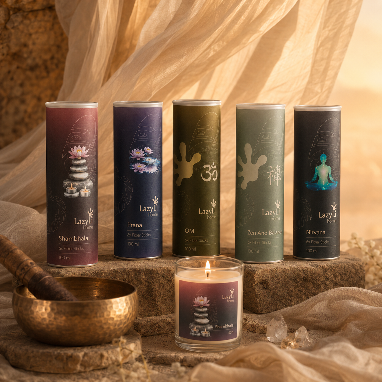
Diffusers & labels
Diffusers and labels on a calm background
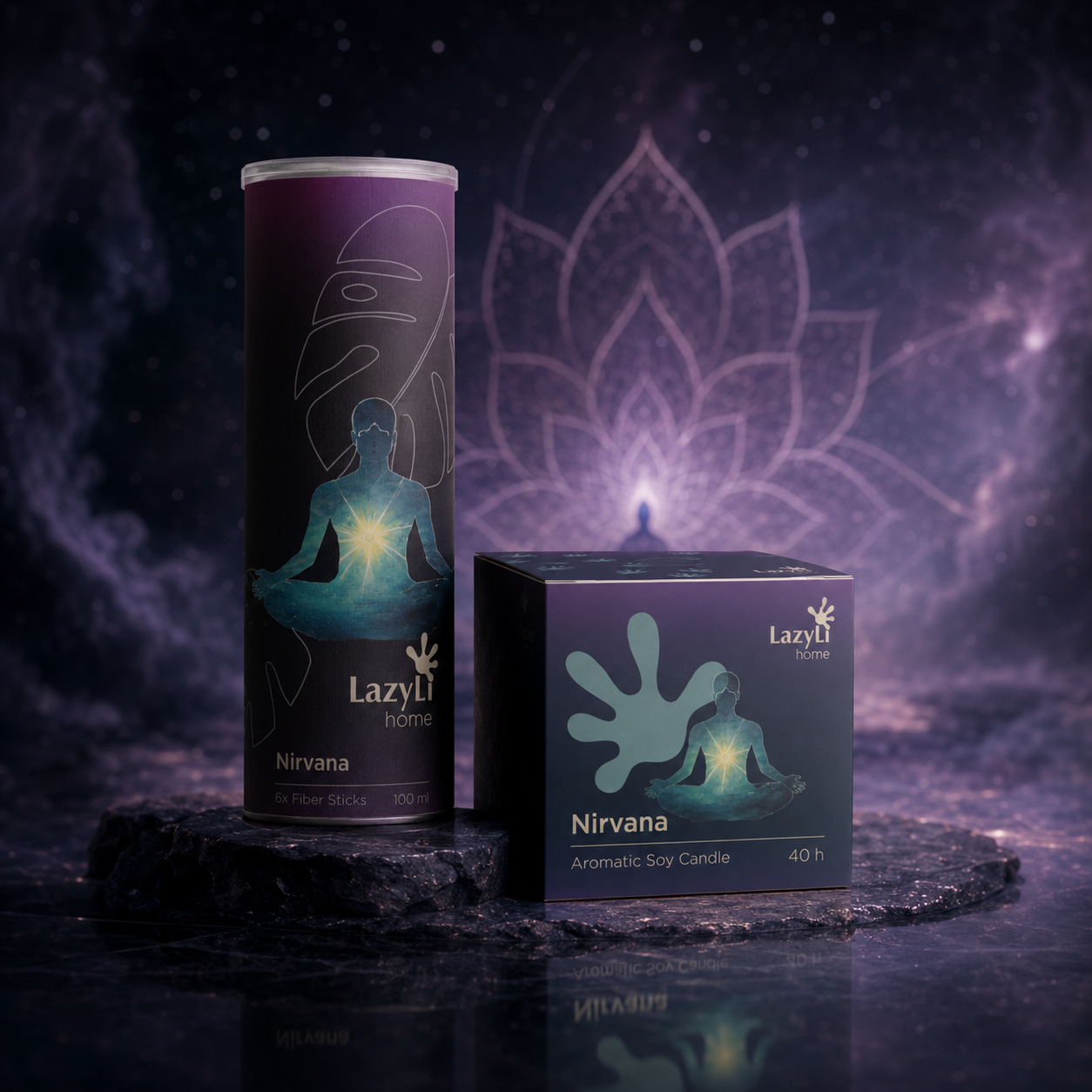
Nirvana
A deep meditative scene
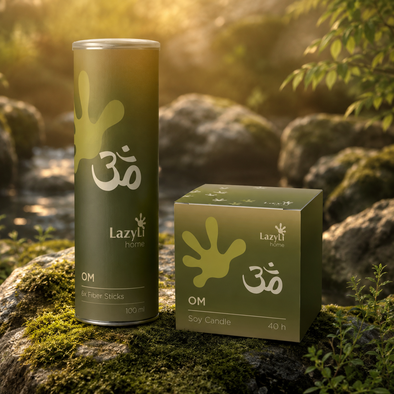
OM
Natural wellness energy
Brand guide PDF
Wild Nature Brand Guide
The brand book section remains in a slider format, as in the original website structure. Below is a selection of key pages and visuals that showcase the concept, product lines, social media, and signature brand elements.
LazyLi Brand Guide PDF
Placeholder
Slides are left blank to accommodate PDF exports later.
Structure
Inside, you can place a cover, audience analysis, positioning, brand platform, product architecture, visual system, packaging, digital templates, and a launch summary.
Ready to grow?
Let's discuss the budget, timeframe, and what really works here and now.
Leave a request - I will review the task and suggest a work format.