01 / Approach
Developed a deep concept for a premium product
The website's structure, navigation, fonts, and overall style remained unchanged. The final version of the case study reveals the LazyLi brand as a holistic system: audience analysis, concept, product line architecture, packaging, digital, and social media.
Strategy
Premium positioning in the home fragrance category
Fragrance is presented as part of the home's aesthetics and restoration scenarios: not a decorative accessory, but a way to customize space, rhythm, and emotional state.
Architecture
Three collections within one brand
The Basic, Resorts, and Meditation lines function as distinct mood scenarios, but remain unified through typography, palette, and branding elements.
System
Identity for packaging, digital and media
The signature paw, natural textures, clean composition, and calm palette form a system that can be easily scaled across products, social media, merch, and a catalog website.
02 / Concept
A product that takes us back to our roots
LazyLi builds a premium home fragrance around nature, tactility, and personal rituals: the scent helps you slow down, feel at home, and restore emotional depth to the space.
LazyLi is more than just a home product.
The brand platform is built around a sense of primordiality: natural materials, soft light, clean air, soothing touches, and fragrance as a personal ritual. LazyLi helps you slow down and restore emotional depth to your space.
This is a premium home fragrance that sells not just a scent, but a state of being: home as a place of restoration, packaging as a tactile object, and a product line as a mood scenario—from everyday tranquility to resort relaxation and meditation.
Nature - Organic textures, botanical motifs and a calm palette instead of visual noise.
Ritual - Aroma is perceived as an action: lighting a candle, placing a diffuser, setting up the space.
Premium - Clean compositions, discreet graphics and packaging that you want to leave in the interior.

03 / Brandbook
How the visual system is revealed in product lines
The three collections are united into a single brand architecture. Within each line, the visuals are structured according to a single principle: first the product and packaging, then the media and inspiration, so that the system is read as a whole, not as a collection of disparate images.
Brand in use / 01
Basic line
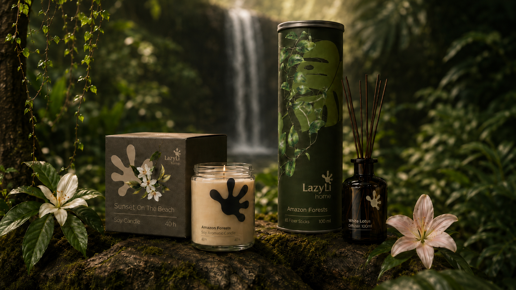
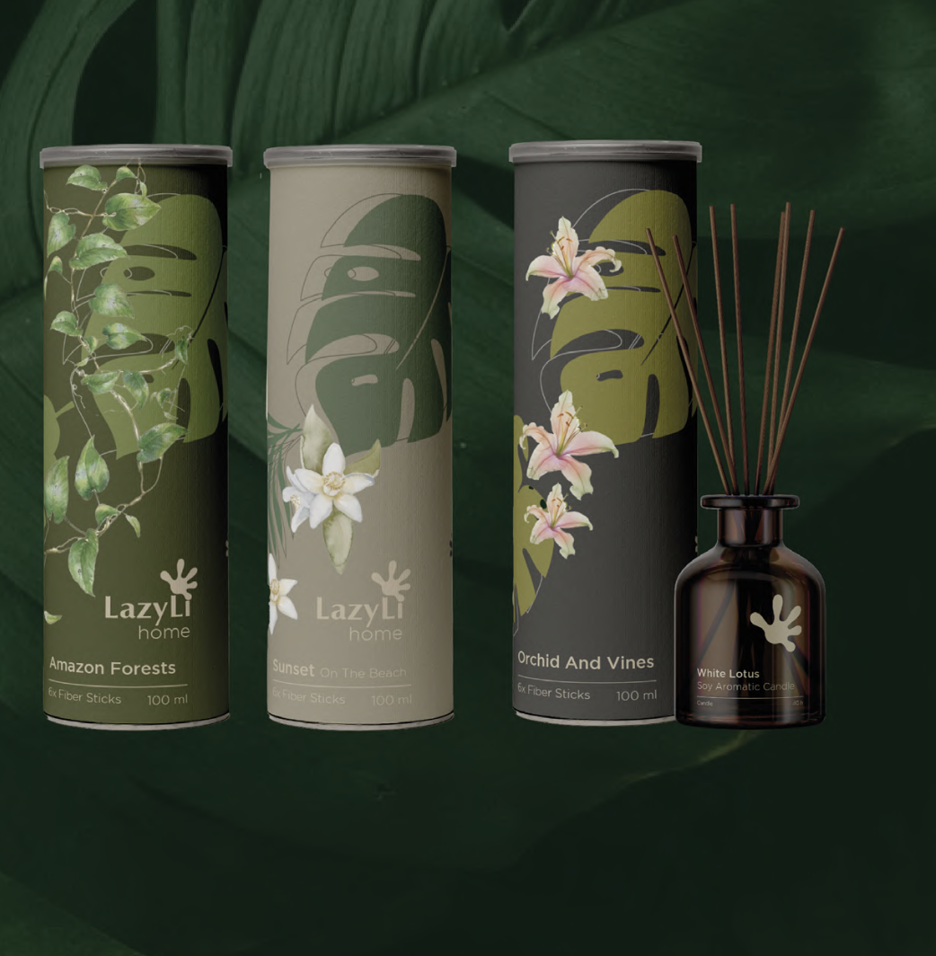
The basic line embodies LazyLi's core values: naturalness, tactility, and a calm premium feel. Here, the product is perceived as an interior ritual—from the diffuser and candle to the craft packaging for marketplaces and branded media.
Brand in use
The basic line in context
Diffusers & tubes
Basic series diffusers and tubes
Candle packaging
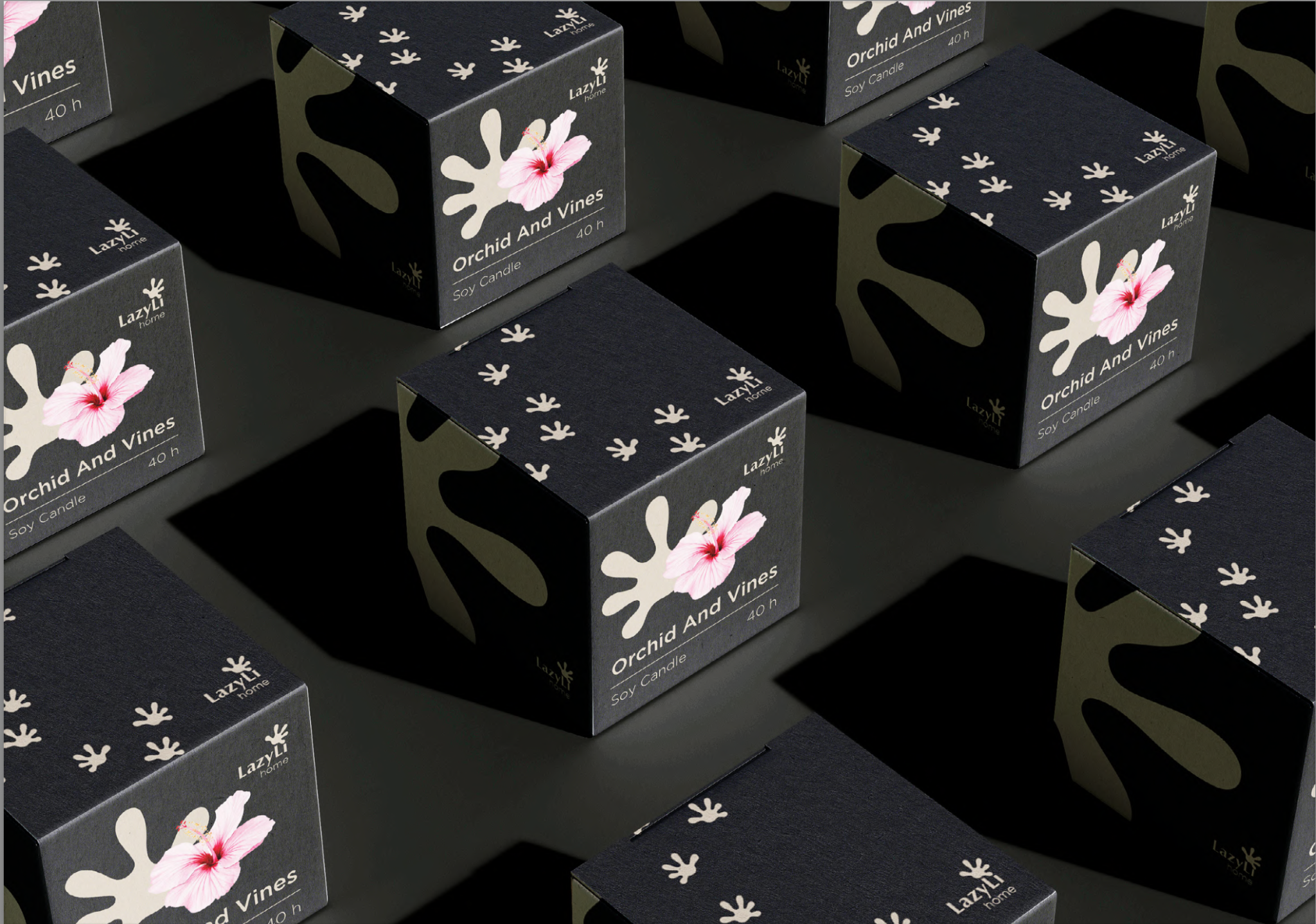
Candle as an interior object
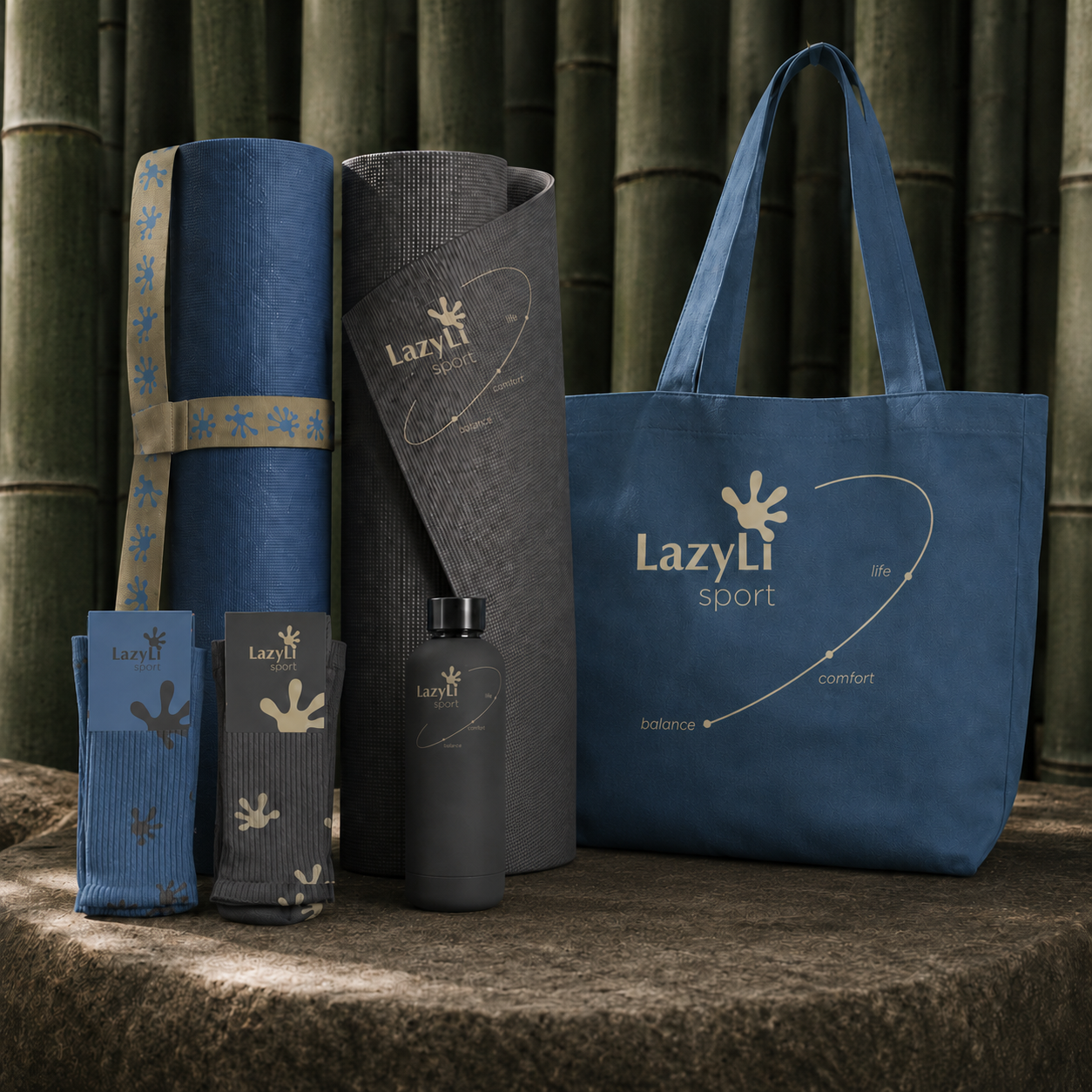
Merch & carriers
Carriers of the lifestyle script

Nature inspiration
Natural dramaturgy

Botanical texture
Leaves, texture, naturalness

Bamboo texture
Deep green background
The core line delivers on the brand's promise: to bring the home back to natural tranquility and simple sensory rituals.
- unified system of fragrances and SKUs
- quiet packaging without visual noise
- media that expand the brand's lifestyle image
Brand platform
The meaning of the baseline
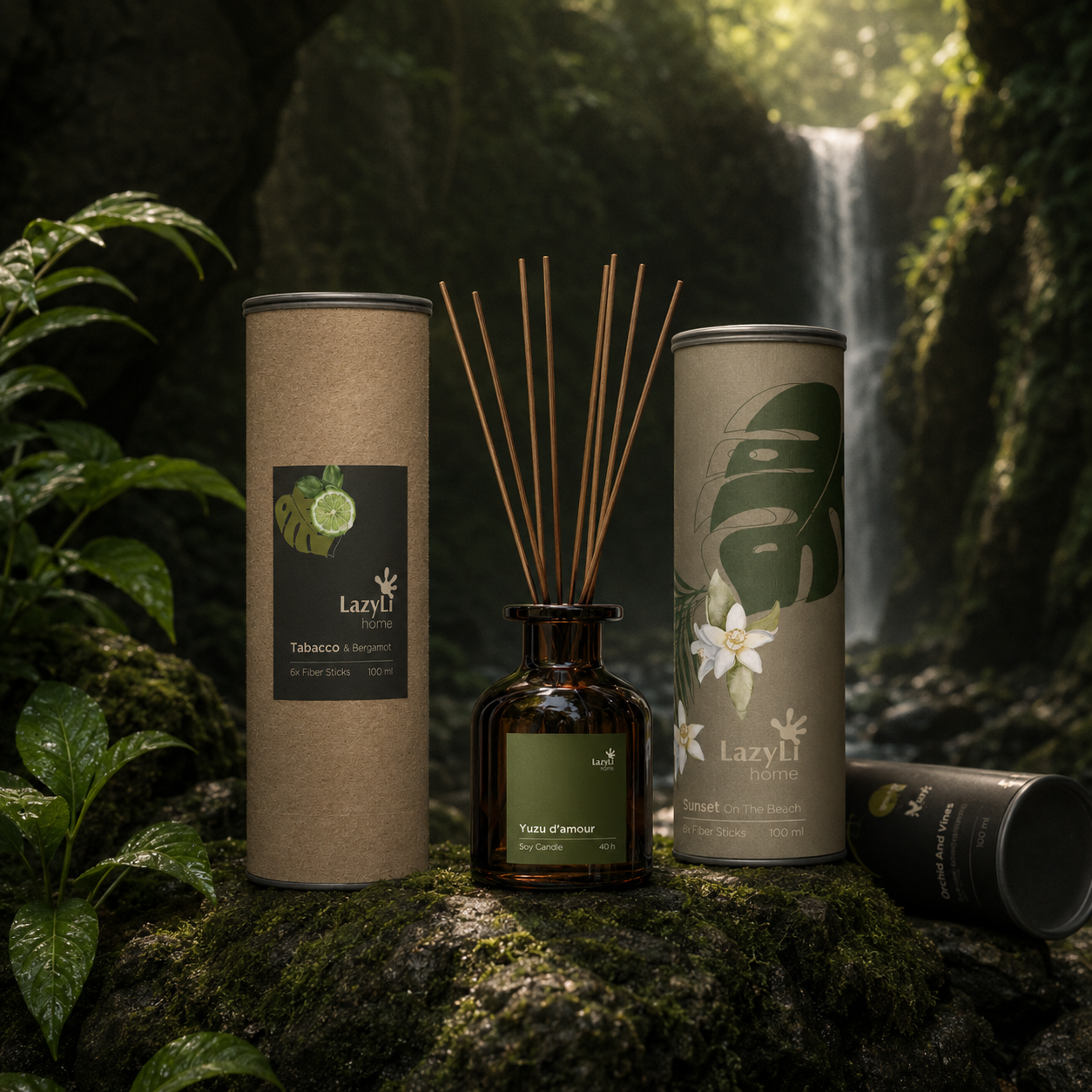
Home ritual pack
Candles and diffusers in a single visual code
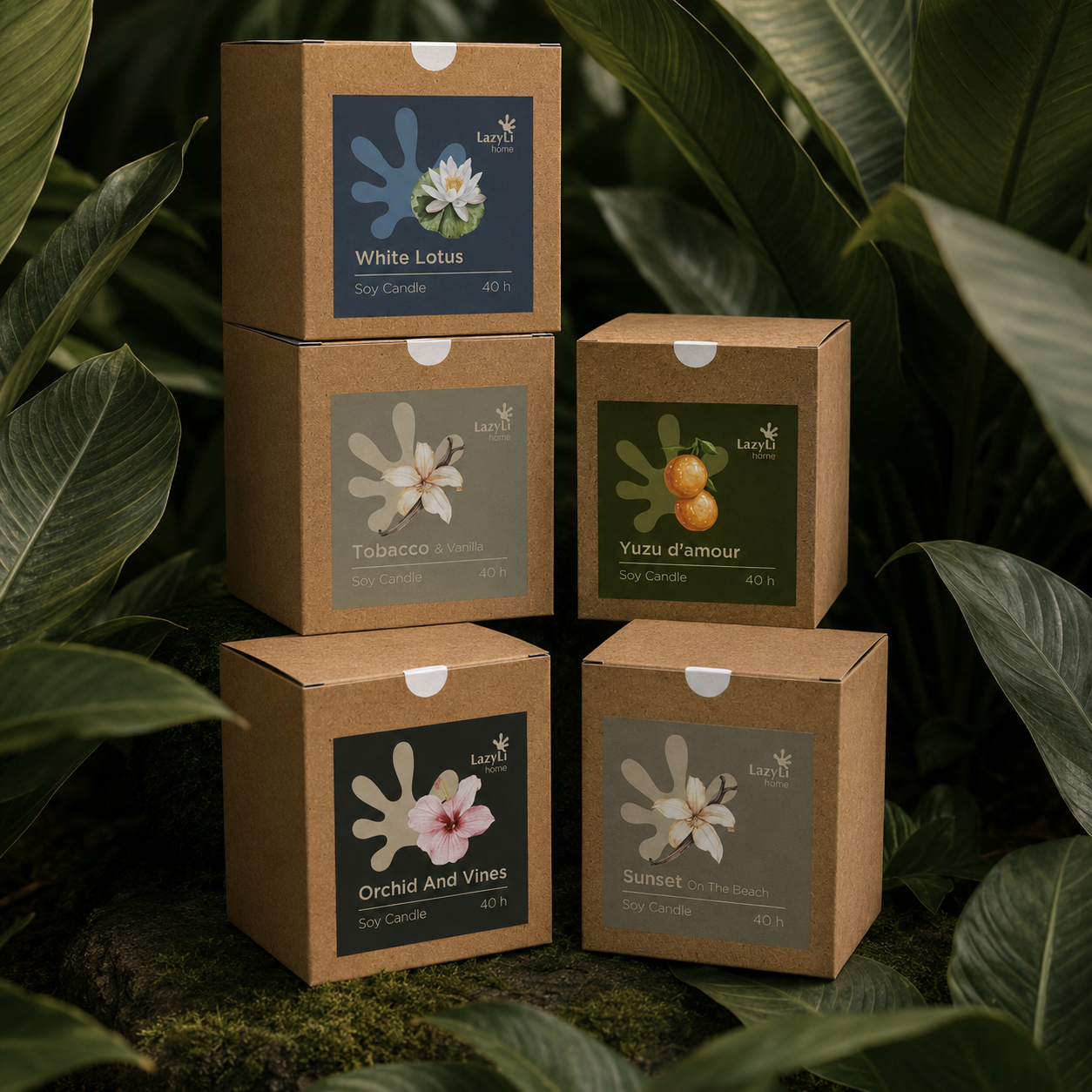
Signature tubes
Basic line tubes as shelf presence
Marketplace detail
Craft feed and sticker system
Brand in use / 02
Resorts line«
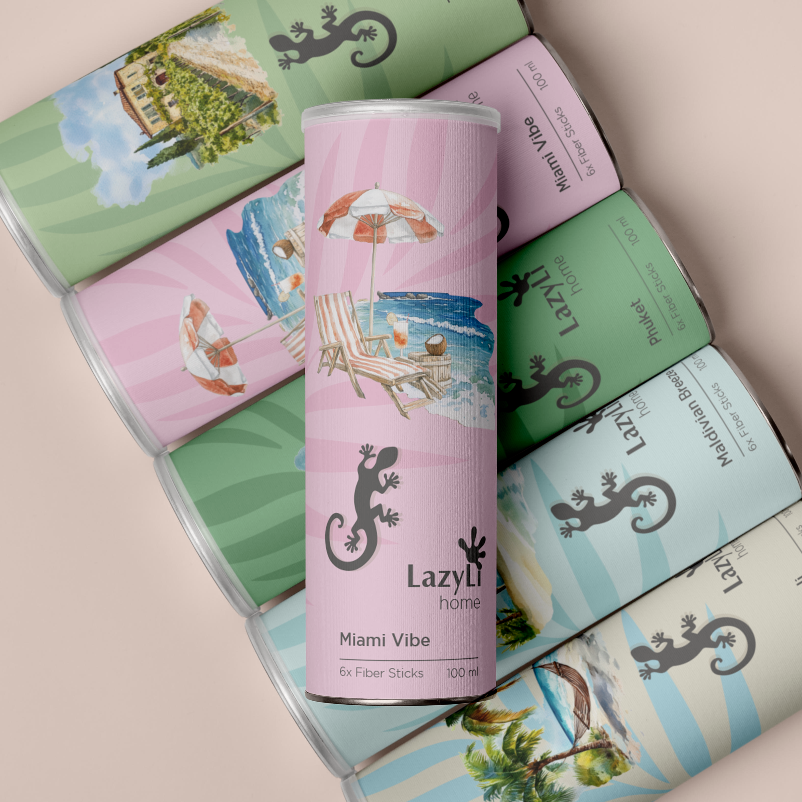
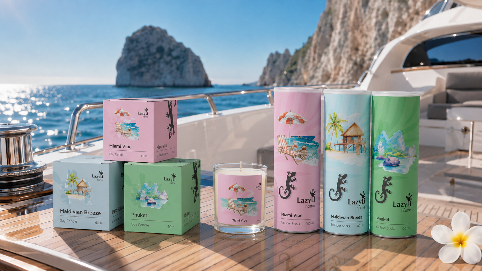
The "Resorts" line translates the brand into emotional vacation scenarios: Bali, Maldives, Miami, Phuket, Santorini, and Tuscany. Each destination receives its own visual atmosphere, but retains the overall packaging format, typography, and premium LazyLi code.
Full print packaging
Tubes and boxes of the resort line
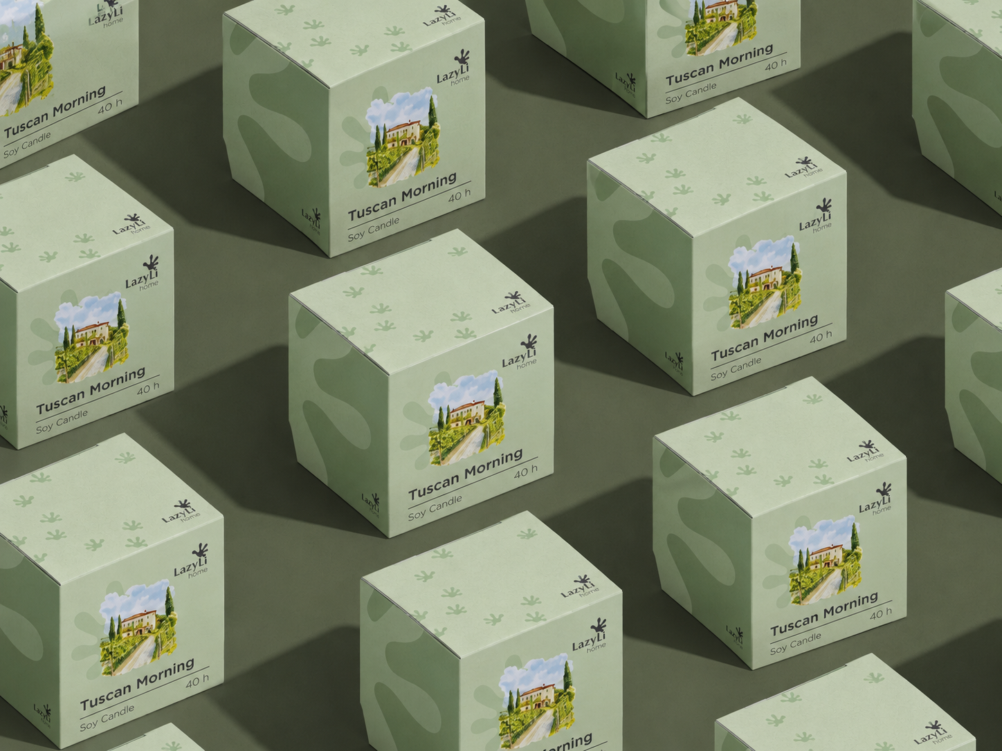
Tuscan Morning packaging
Olive palette of the resort series
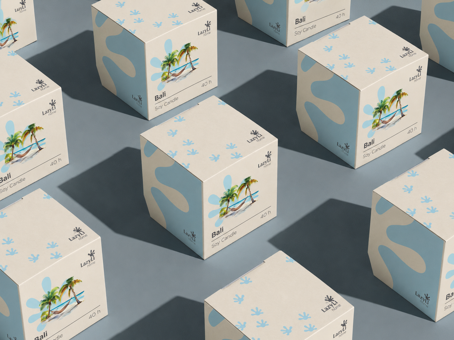
Bali Resort packaging
Warm resort visual code
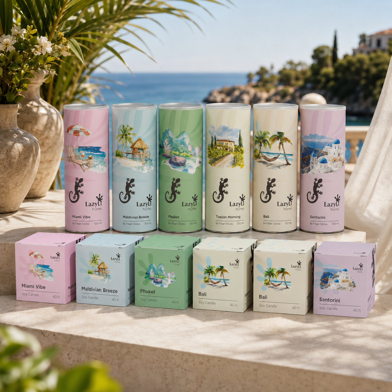
Resort design system
Unified visual system
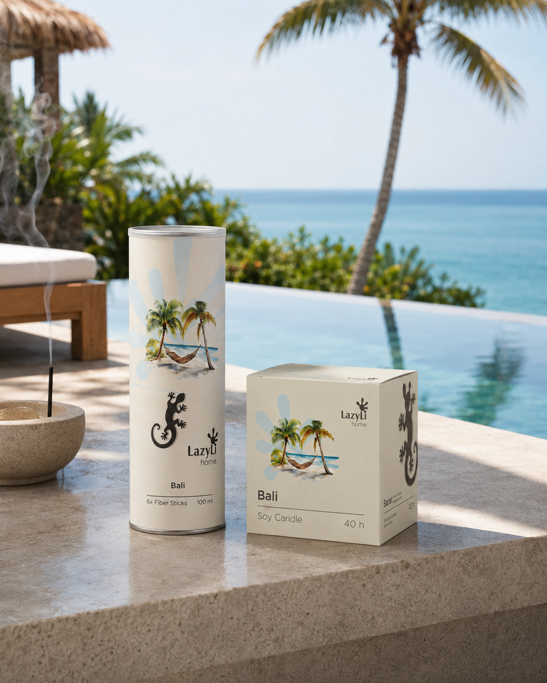
Bali packaging
Direction 01
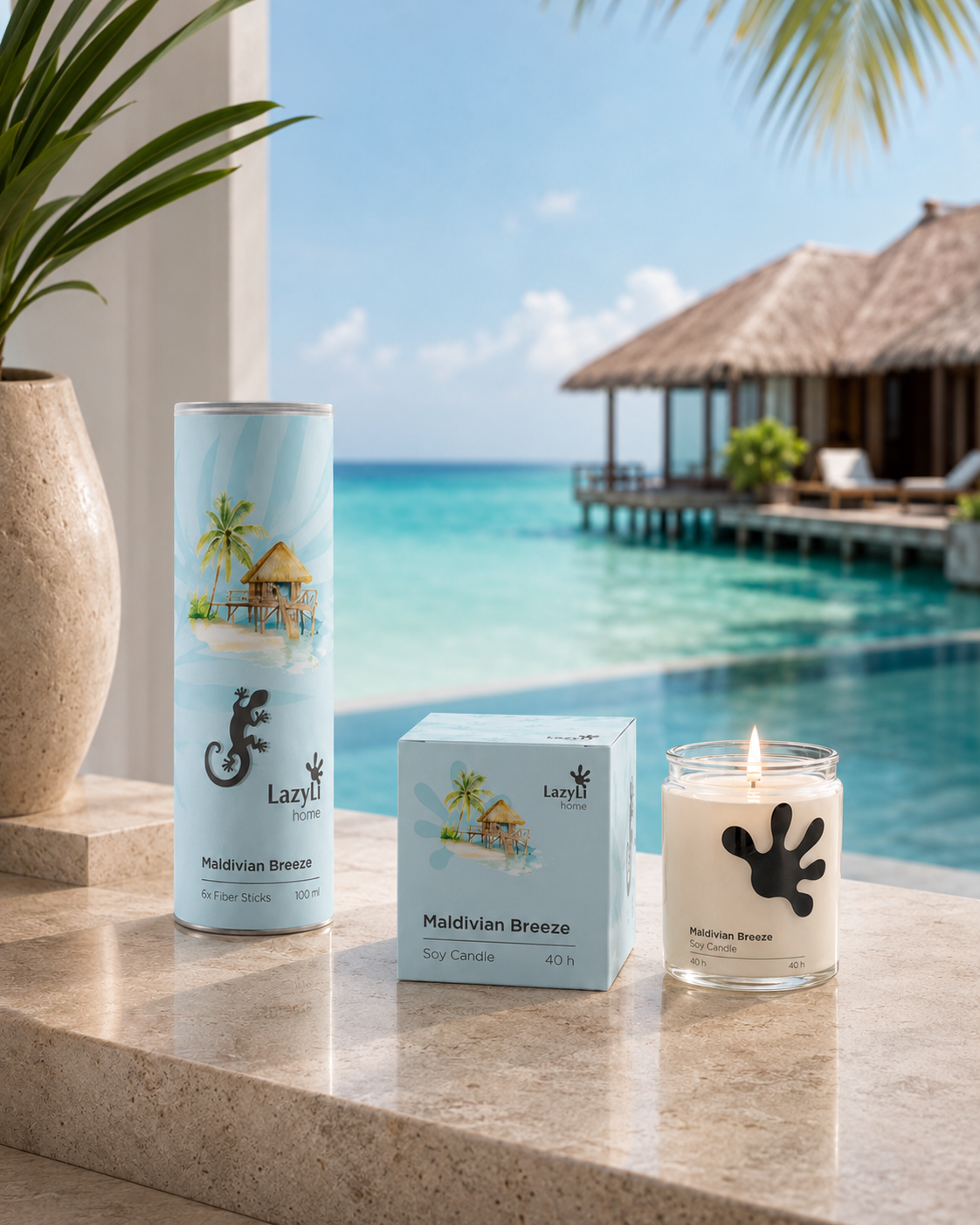
Maldive packaging
Direction 02
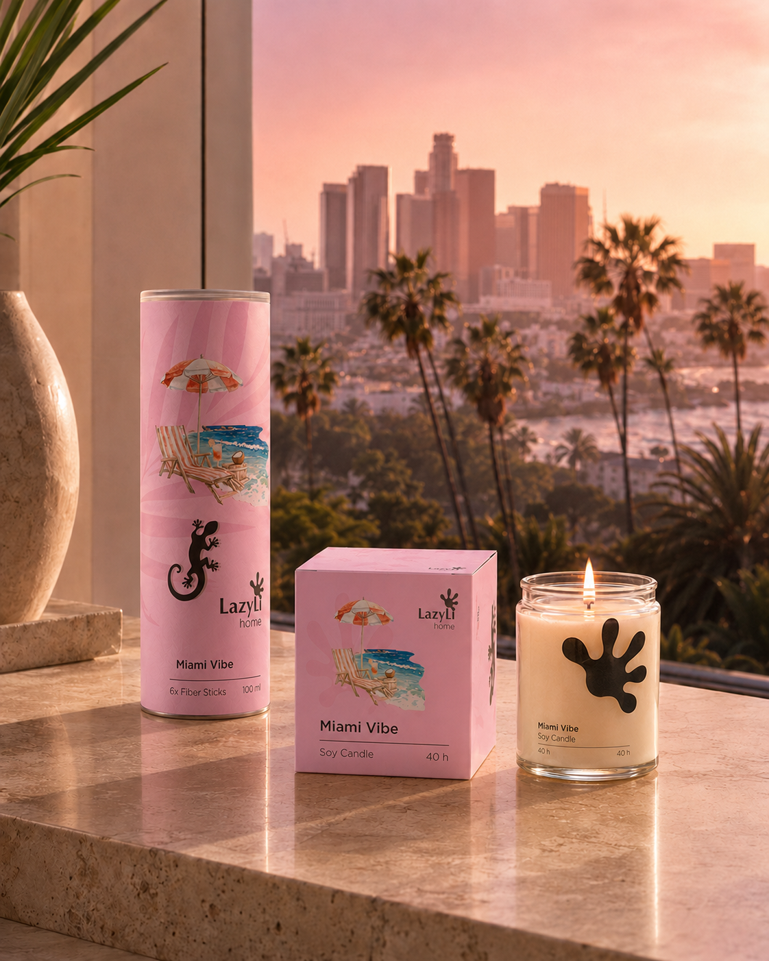
Miami packaging
Direction 03

Moodboard / Miami
Urban resort atmosphere

Moodboard / Maldives
Soft island atmosphere

Moodboard / Coast
Fresh Coastline
The resort line sells the feeling of relaxation: each geography is read through color, illustration, and atmospheric reference, but the entire series remains recognizable as LazyLi
- uniform shape of tubes and boxes
- different color codes for directions
- moodboard next to product graphics
Collection logic
How does the series work?
Brand in use / 01
Meditation Line«
The Meditation line is becoming more intimate and wellness-oriented: deep shades, soft natural references, calm scenes and packaging that supports a sense of inner balance and ritual.
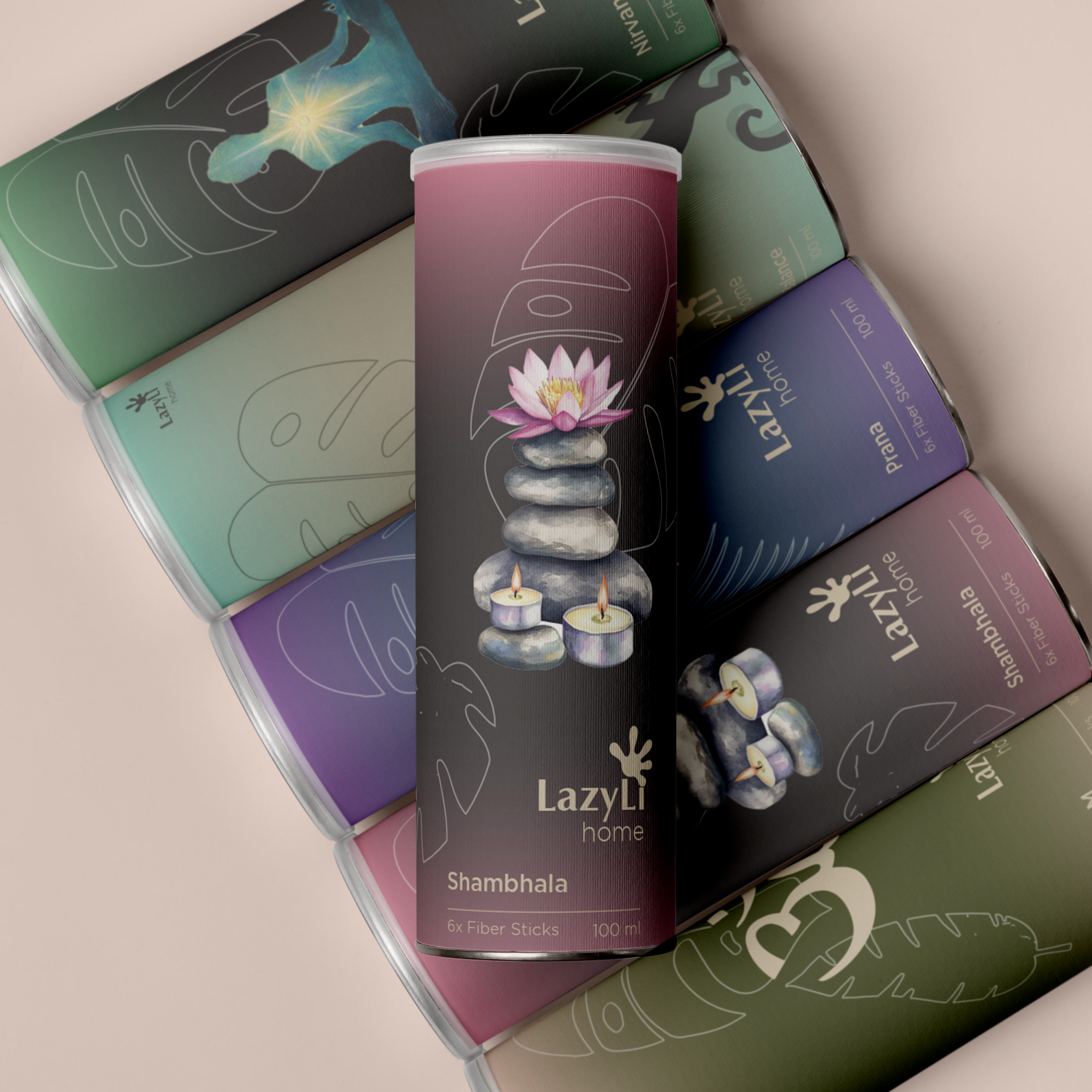
Meditation line
A deep series for a quiet ritual
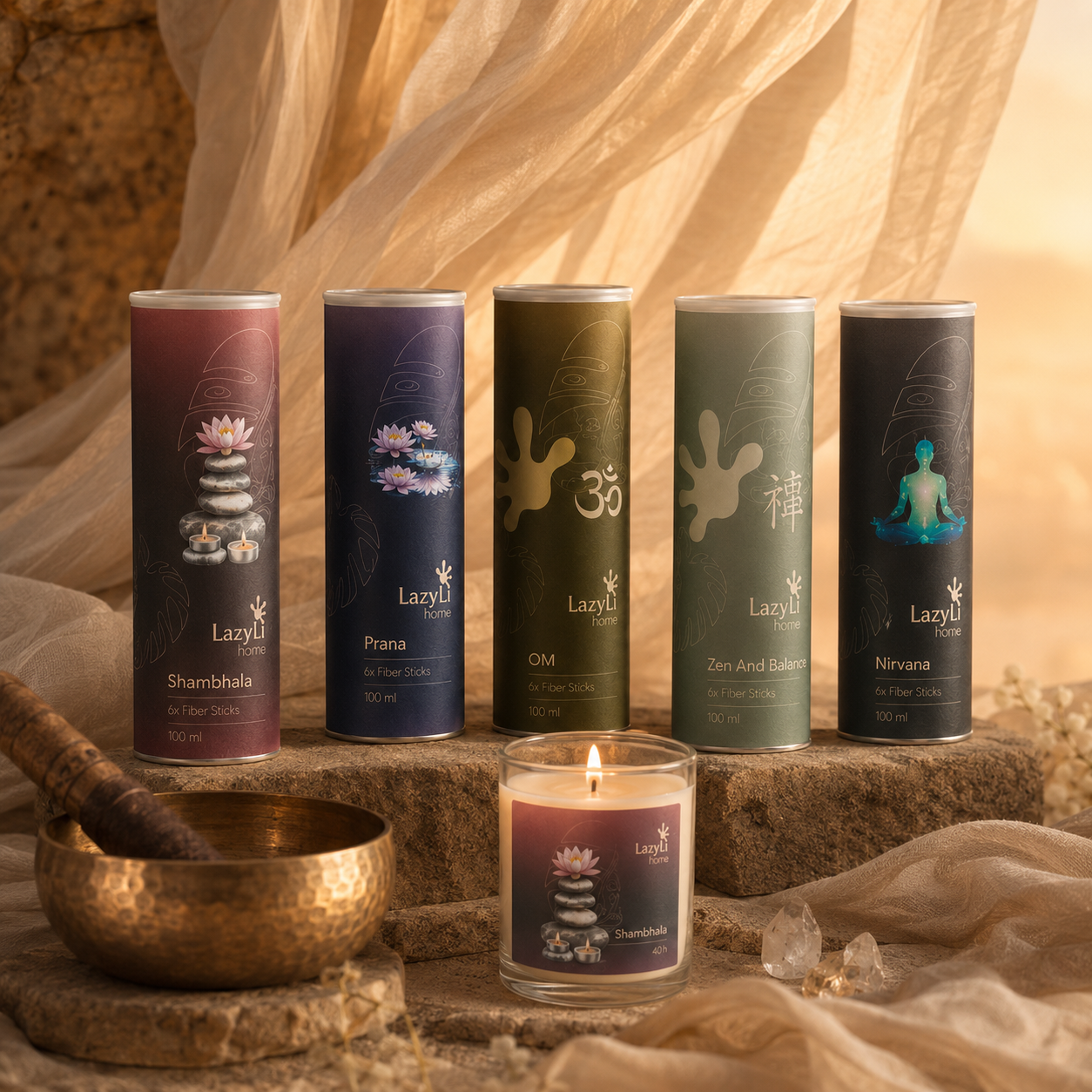
Diffusers & Labels
Diffusers and labels on a calm background
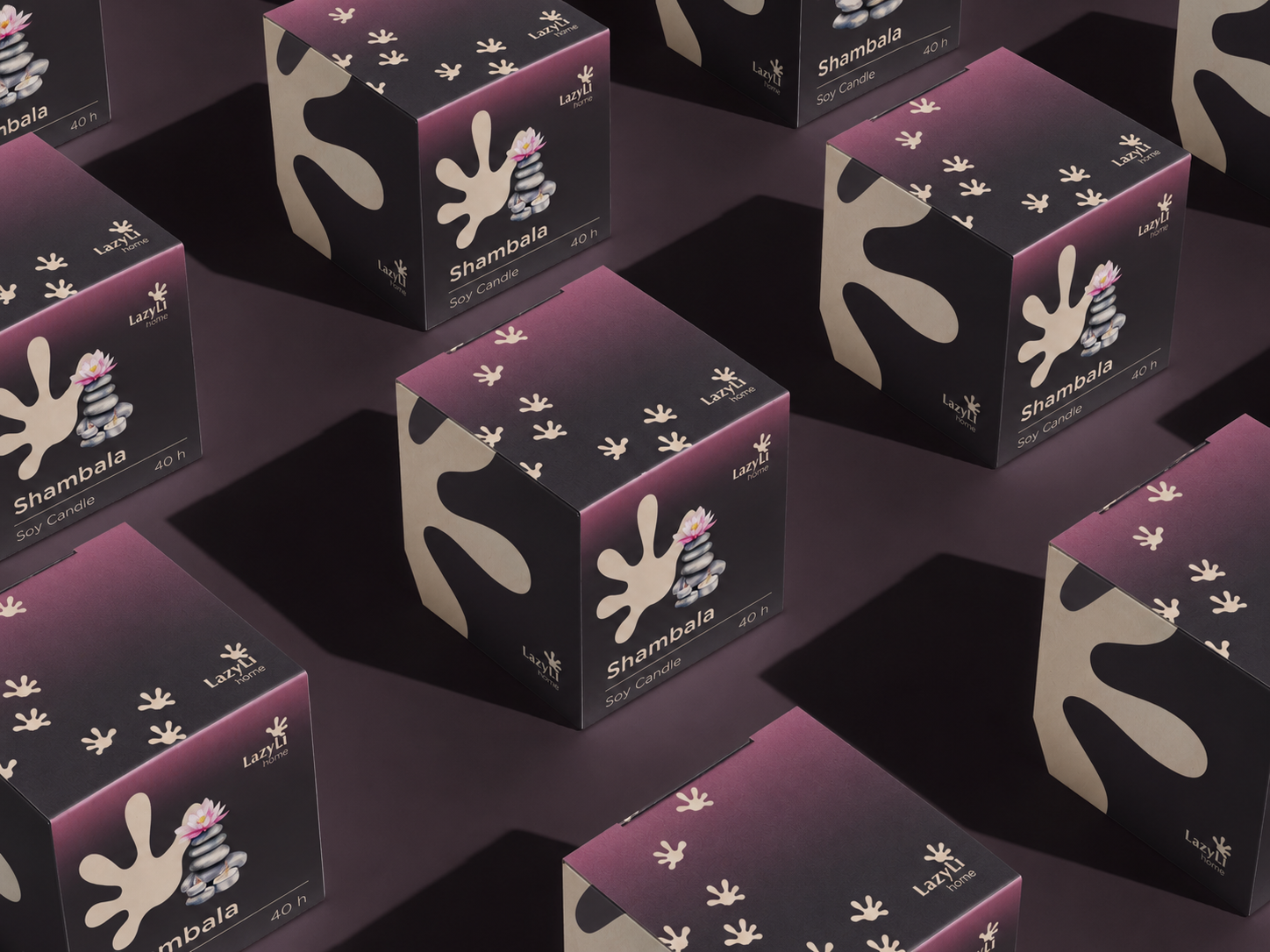
Meditation packaging
Packaging with soft tactile logic
Candle packaging
Boxes and candles series

Meditation inspiration
Silence, breathing, warmth

Soft ritual reference
Reference for slowing down and breathing
Brand in use
Collection of candles and diffusers
In this line, the packaging supports not just decorativeness, but a state of internal balance: the product looks like part of a wellness ritual and a calm home practice.
- deep, intimate palette
- soft natural references
- packaging without unnecessary visual clutter
Ritual logic
The meaning of the meditation series
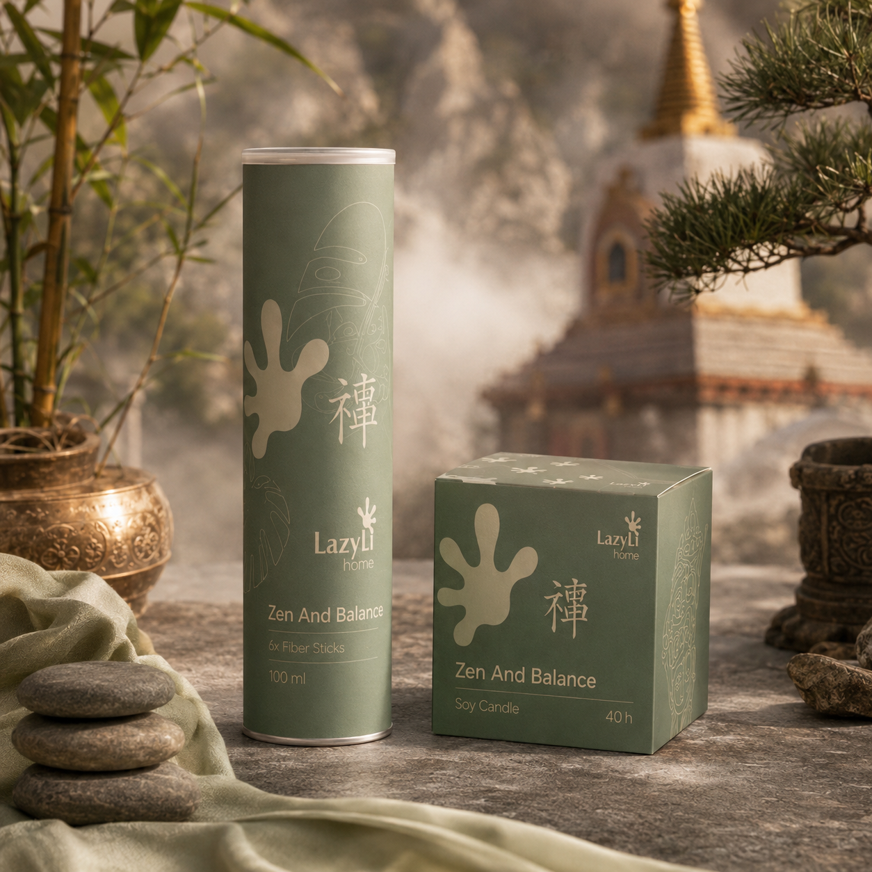
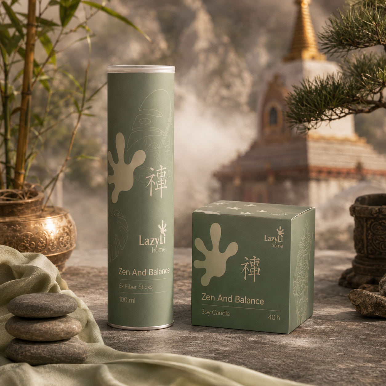
Zen and Balance
Eastern ritual of tranquility
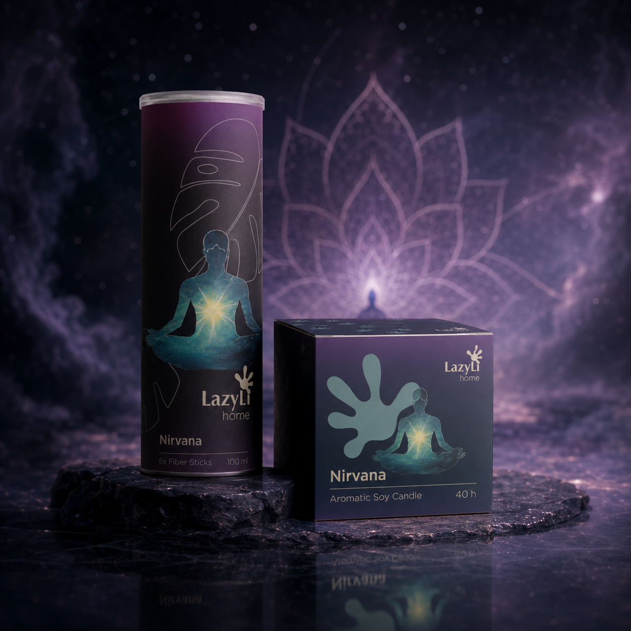
Nirvana
A deep meditative scene
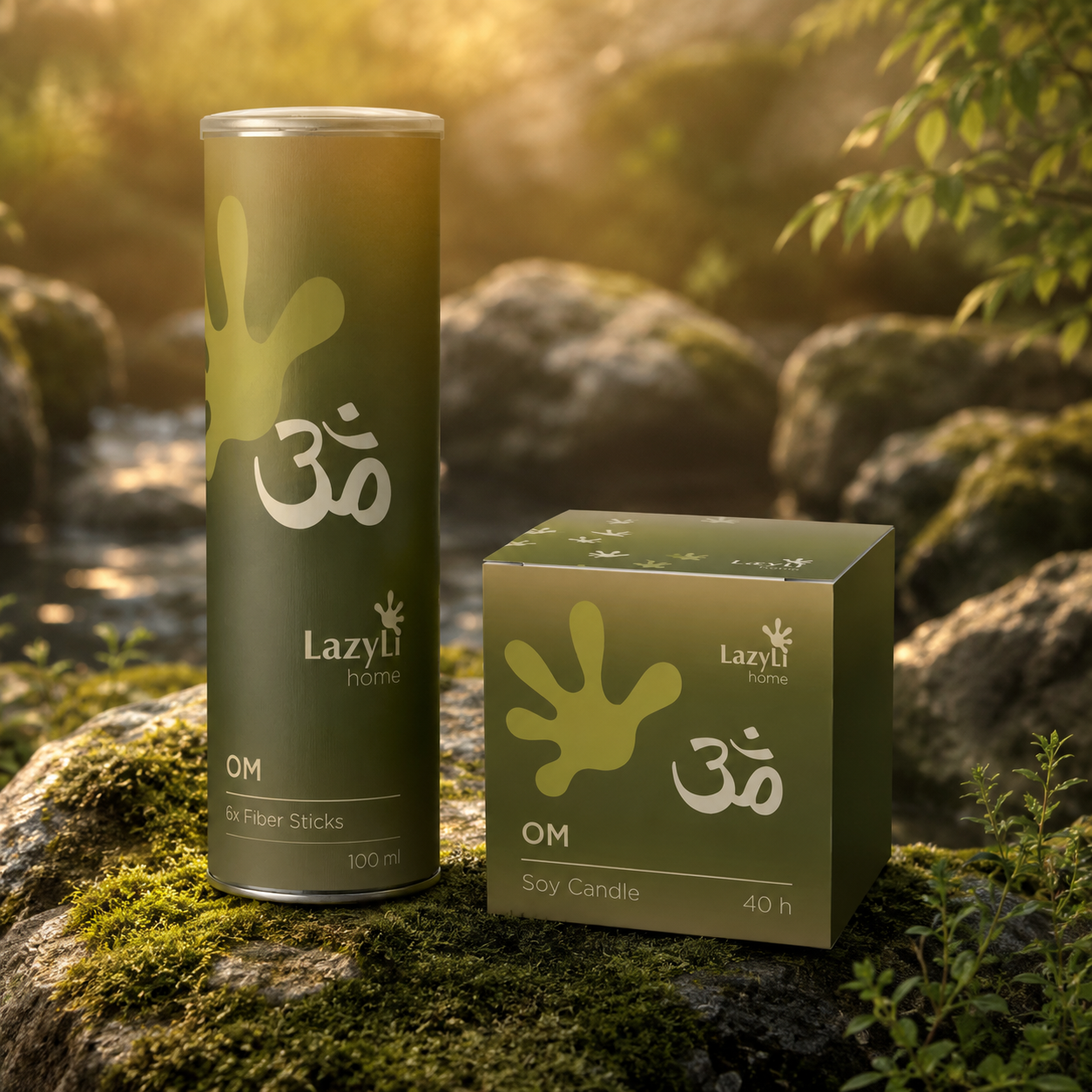
OM
Natural wellness energy
04 / Brand guide PDF
LazyLi Brand Guide
The brand book section remains in a slider format, as in the original website structure. Below is a selection of key pages and visuals that showcase the concept, product lines, social media, and signature brand elements.
LazyLi Brand Guide PDF
Key emphasis
A brand book outlines the strategy, visual language, and rules for scaling a brand.
It brings together the key elements of the system: concept, palette, product lines, packaging, social media and media, which work as a single premium code.
Why is this important?
This is a case about the concept, not just about pretty packaging.
The project's core value lies in the depth of its development: from the audience and idea to the brand's visual behavior across various formats and collections.
05 / Identity
Logo, palette and brand elements
LazyLi's identity is built on a natural palette, soft typography, a paw print as the main brand element, and a system of decorative arcs that link packaging, social media, merch, and digital into a unified visual language.
LazyLi
Logo
The main symbol is the word composition LazyLi with a graphic trace of a lizard.
Palette
Signature colours: olive, khaki beige, muted blue and graphite.
Elements
The lizard paw, arc, and arc with text are used on packaging, infographics, merch, and the web.
Khaki Beige
#9C947D
Olive Green
#3D4319
Muted Blue
#3D5266
Graphite
#343433




06 / Visual materials
Digital, social media and brand carriers
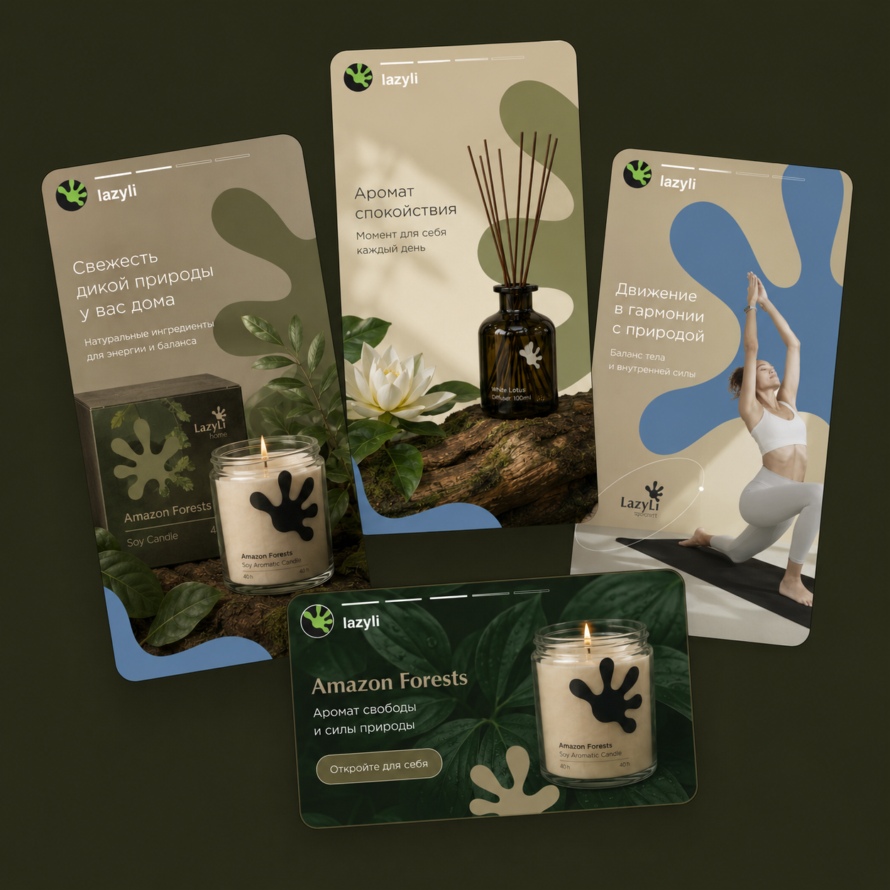
Social media
Basic line
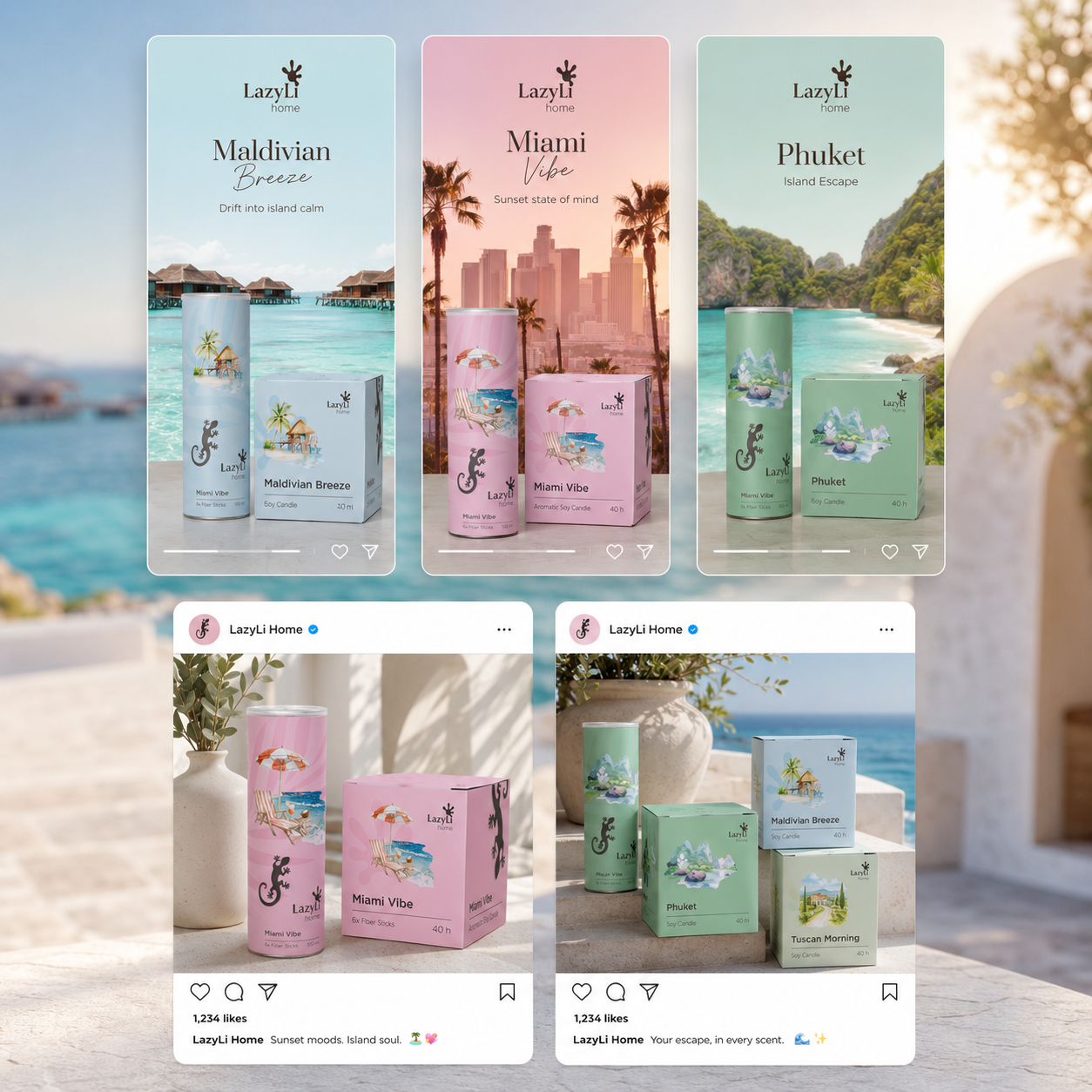
Social media
Resorts
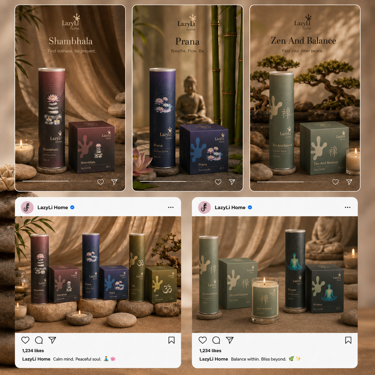
Social media
Meditation
Ready to grow?
Let's discuss the budget, timeframe, and what really works here and now.
Leave a request - I will review the task and suggest a work format.