01 / Approach
We started with the logic of sales and service
The goal wasn't just a visual update. It was also necessary to demonstrate why the premium AC service costs more: who it was created for, what value it provides, and how it communicates to customers in understandable language.
Audience
B2C and B2B
Created separate customer journeys for villa and apartment owners, management companies, and HoReCa businesses.
Value
Value
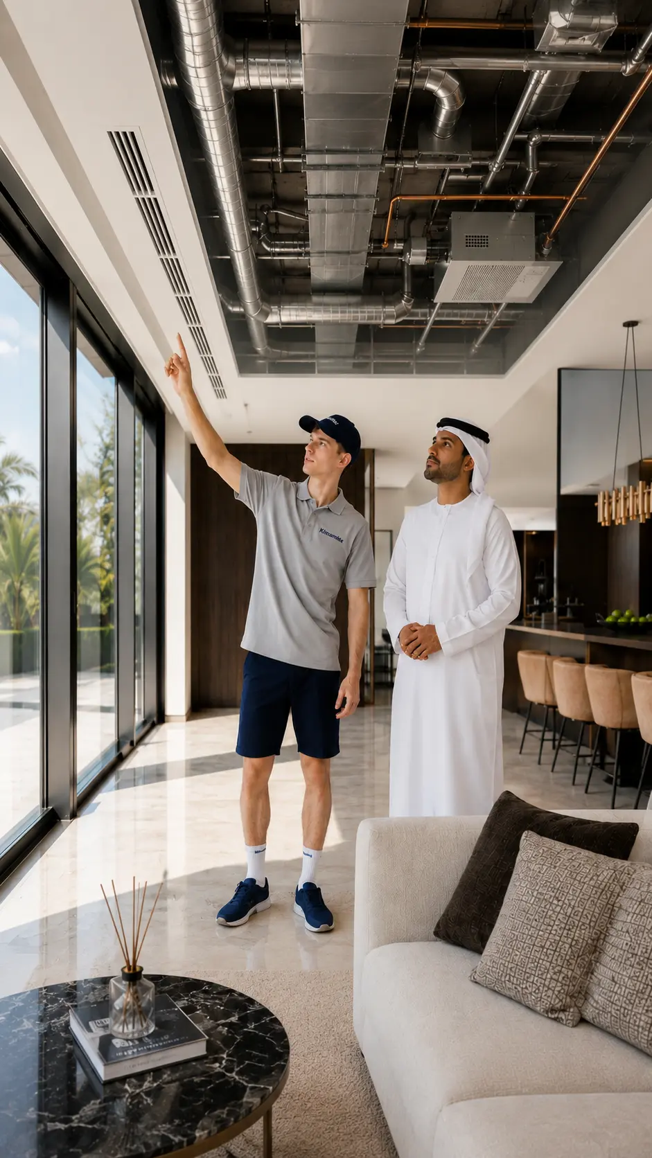
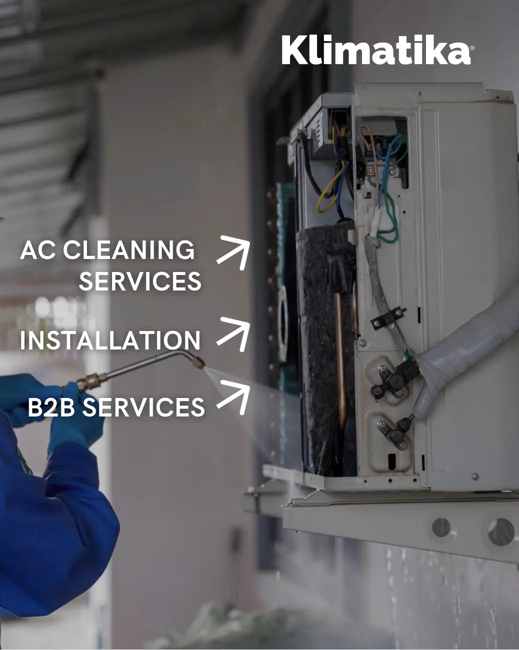
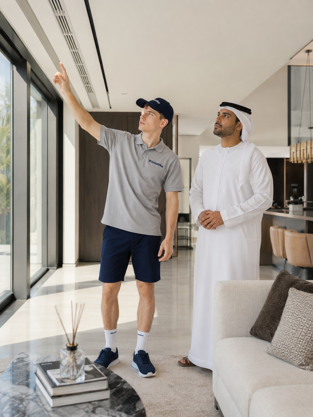
She showed what the client pays more for: careful work, interior protection, a warranty, and a photo report.
Communication
Communication
I divided the services by situation: urgent assistance, deep cleaning, and regular maintenance.
02 / Before - After
A service you trust for your home and comfort
I shifted the focus from the technical scope of work to the result: clean air, stable operation of air conditioners, and peace of mind for the client.
“We care about people and their wellbeing — not just air conditioners”
“We care about people and their wellbeing — not just air conditioners”
Social media
I've simplified the structure, divided services into tasks, and added clear proof of quality. Now clients find the right solution faster and understand what they're paying for.
Website
Carrier
Website
Carriers

Website
Carriers
Website
Carriers
Website
Carriers
Website
Carriers
Website
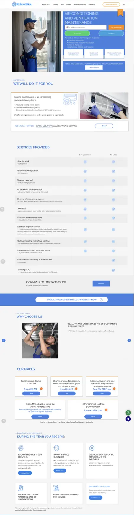
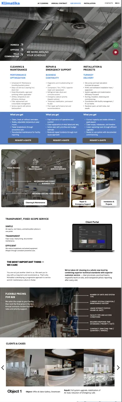
We redesigned the website for a premium audience: clear service selection, quality proof, and quick access to the application.
TO
Carriers of the lifestyle script
AFTER
Carriers of the lifestyle script
EXPERTISE
roprop
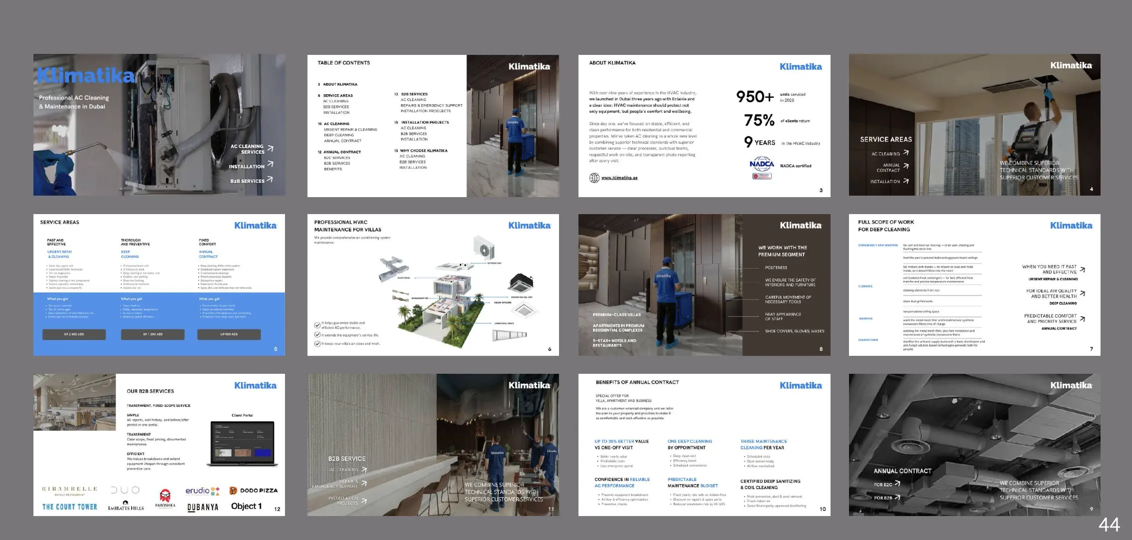
PRESENTATION
Carriers of the lifestyle script
Website
Carriers of the lifestyle script
Positioning
Before the project, Klimatika was perceived as a regular air conditioning service. I built a positioning around technical expertise, meticulous interior design, and high-quality customer service.
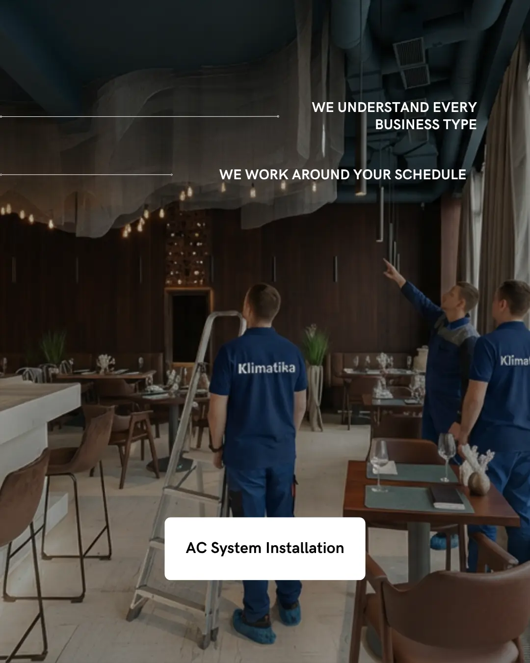
B2B SOLUTIONS
website
AC SYSTEM
website
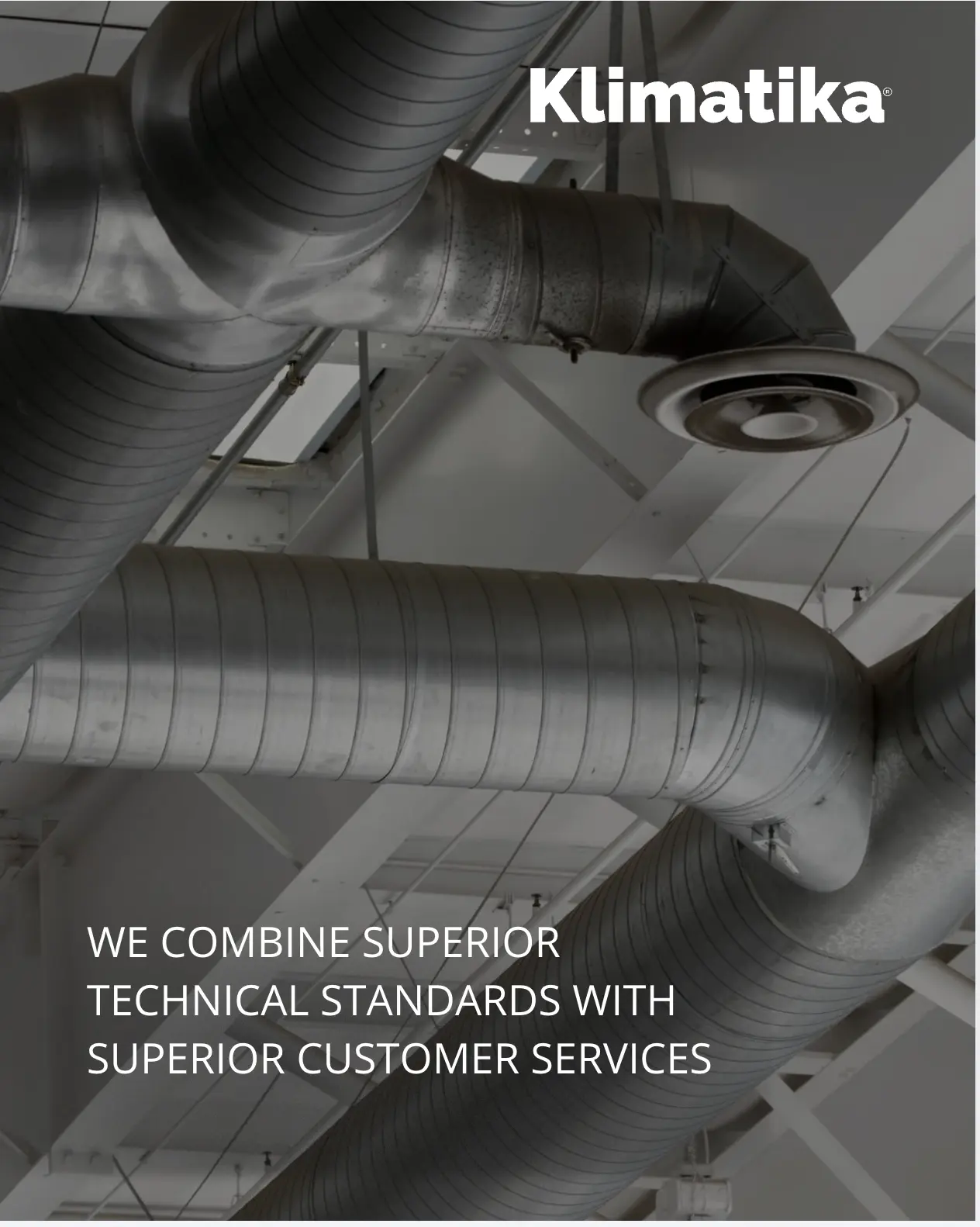
VALUES
brand
SERVICES
website
02 / Before - After
Transforming the delivery: from a fragmented account to a cohesive brand system
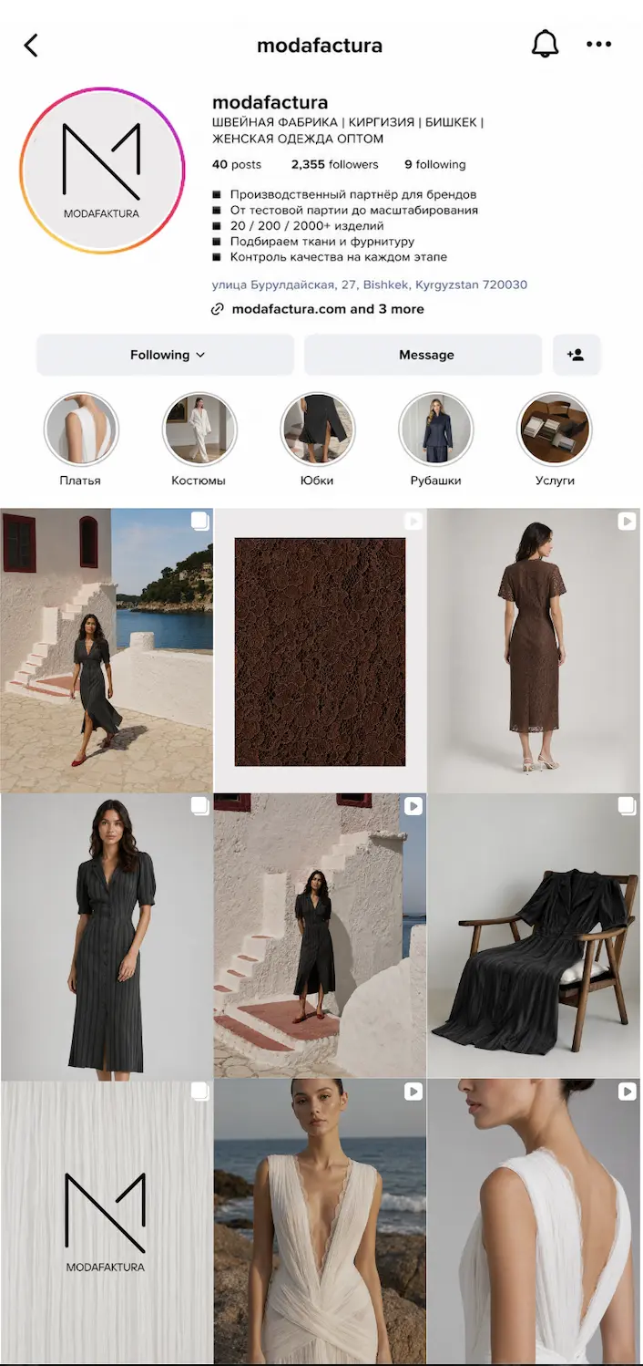
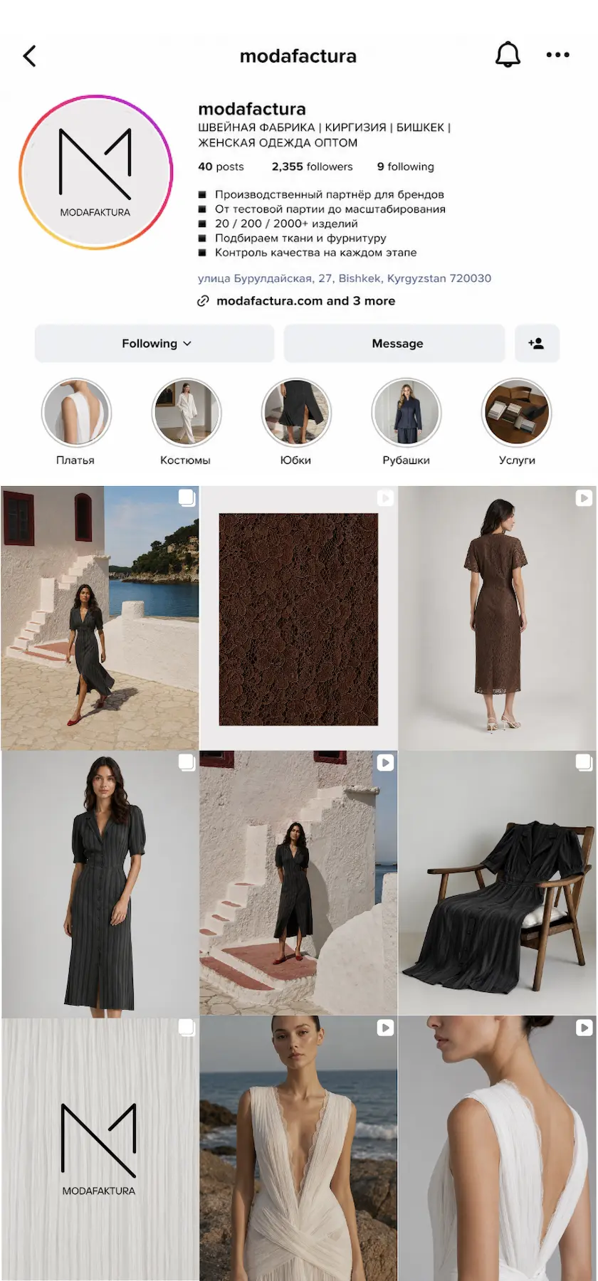
Before the project, the communications system looked like a local production page. Afterward, it became a professional brand platform for a women's clothing factory: with a clear positioning, a new logo, a visual system, and sales channels.
web
03 / Positioning
Brand as a service about comfort, health, and trust
Klimatika doesn't just focus on air conditioner cleaning; it focuses on cleaner air, stable system operation, and a more relaxed customer experience—all with transparent proof of results.
“We care about people and their wellbeing — not just air conditioners”
This formula became the basis for meaning: service is explained through care, predictability, and technical precision, not through a dry list of tasks.
04 / Working materials
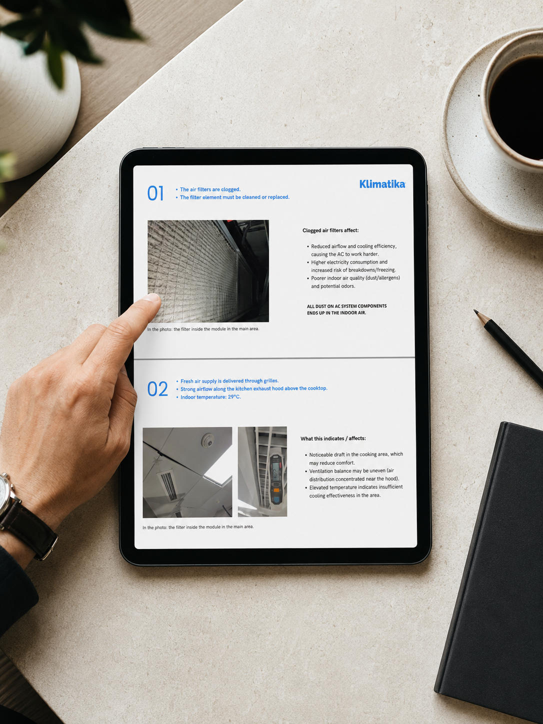
How the brand works in contact with the client
Brand in use
Website, social media, presentation, reports
Consultation
Client contact
Website
Mobile
Service logic
Website
Outdoor
Brand carrier
05 / Brand guide
Klimatika Business Presentation
The brand guide sets out Klimatika's visual system: rules for using the logo, corporate colors, typography, graphic elements, and principles for designing materials. .
Climate Brand Guide
Key emphasis
Services are collected according to the client's needs
The client immediately understands which solution is right for him
Why is this important?
It is easier for the client to choose a service
The website, social media, and presentation all show the services, their composition, and cost in the same way.
06 / Identity
Logo, palette and brand elements
The brand is built on the concepts of purity, engineering, and trust: cool blue tones, technical graphics, simple typography, and understated background elements.
Climate
Logo
The main symbol is the Klimatika word logo.
Backgrounds
White, Deep Navy, or a photograph with a darkening effect
Element
The corporate color is used as a calm graphic accent.
Blue De France
#2183EB
Deep Navy
#194071
Charcoal Gray
#545454
Espresso Brown
#382E28
07 / Visual materials
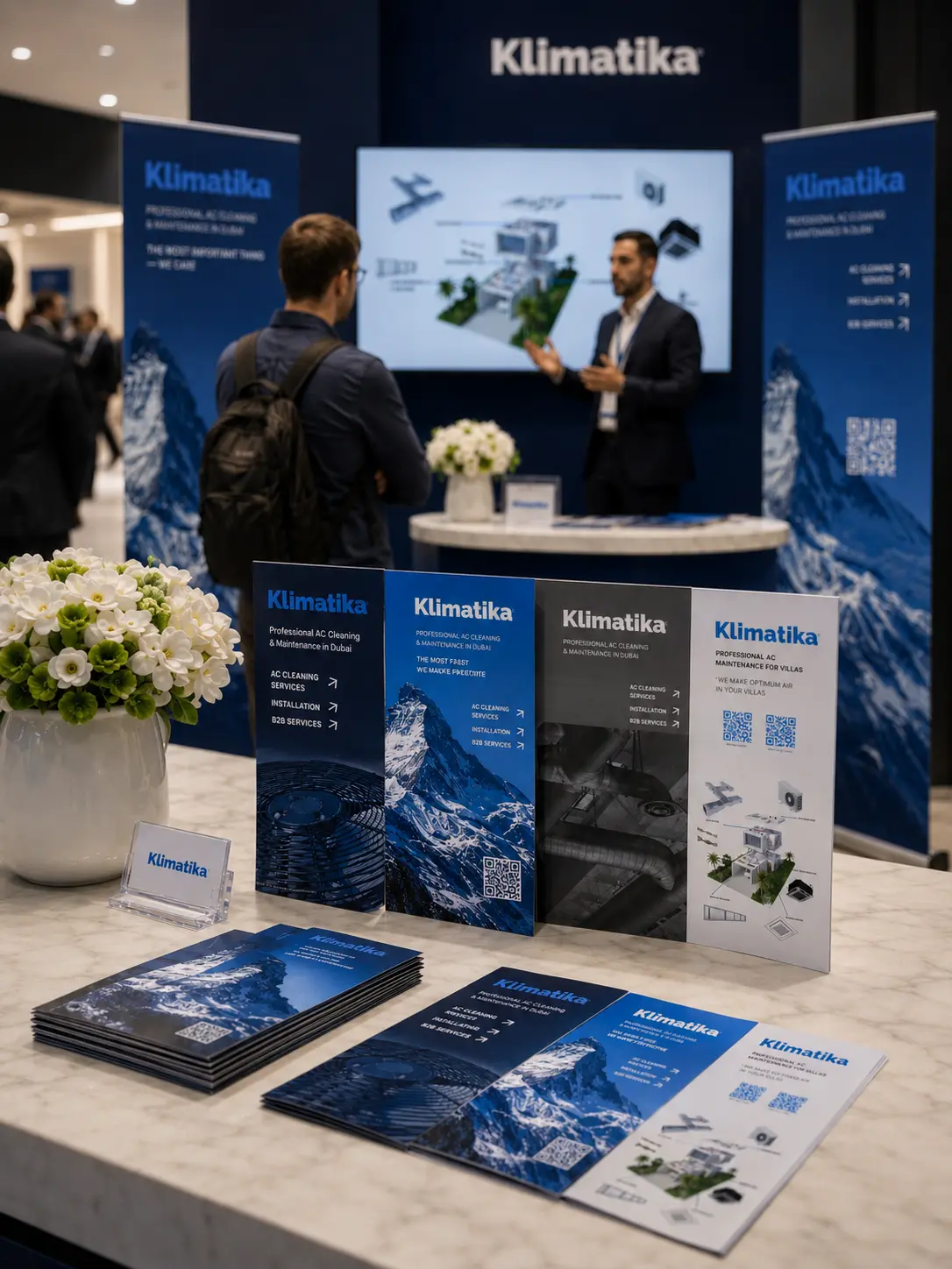
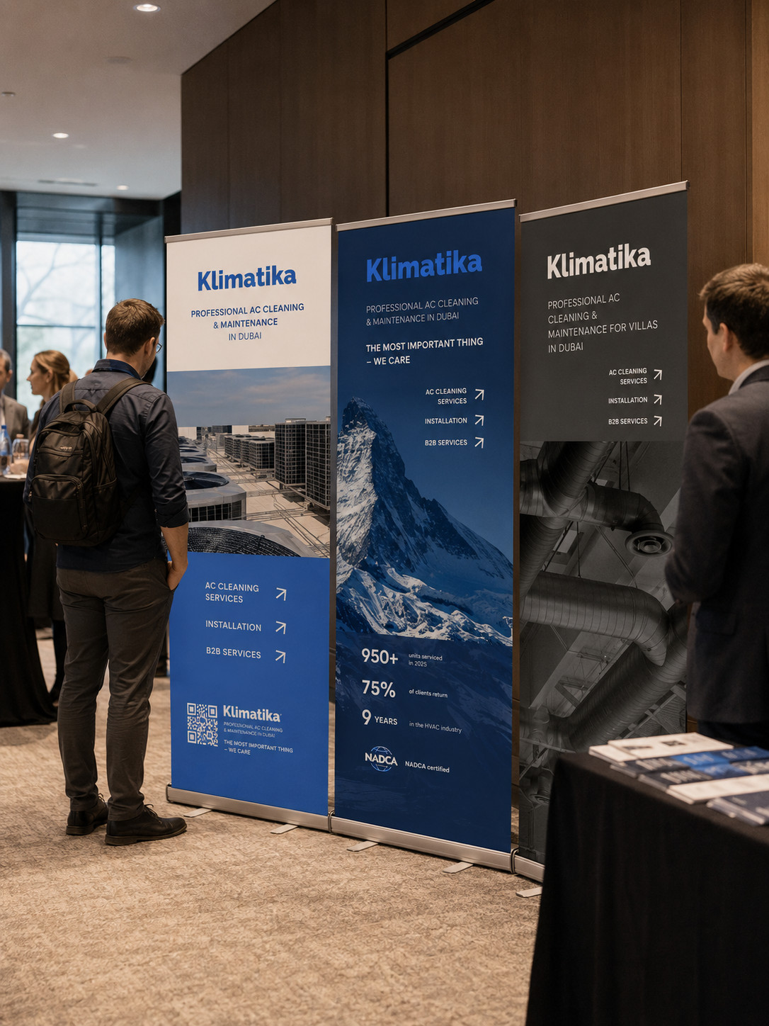
Media and visual materials
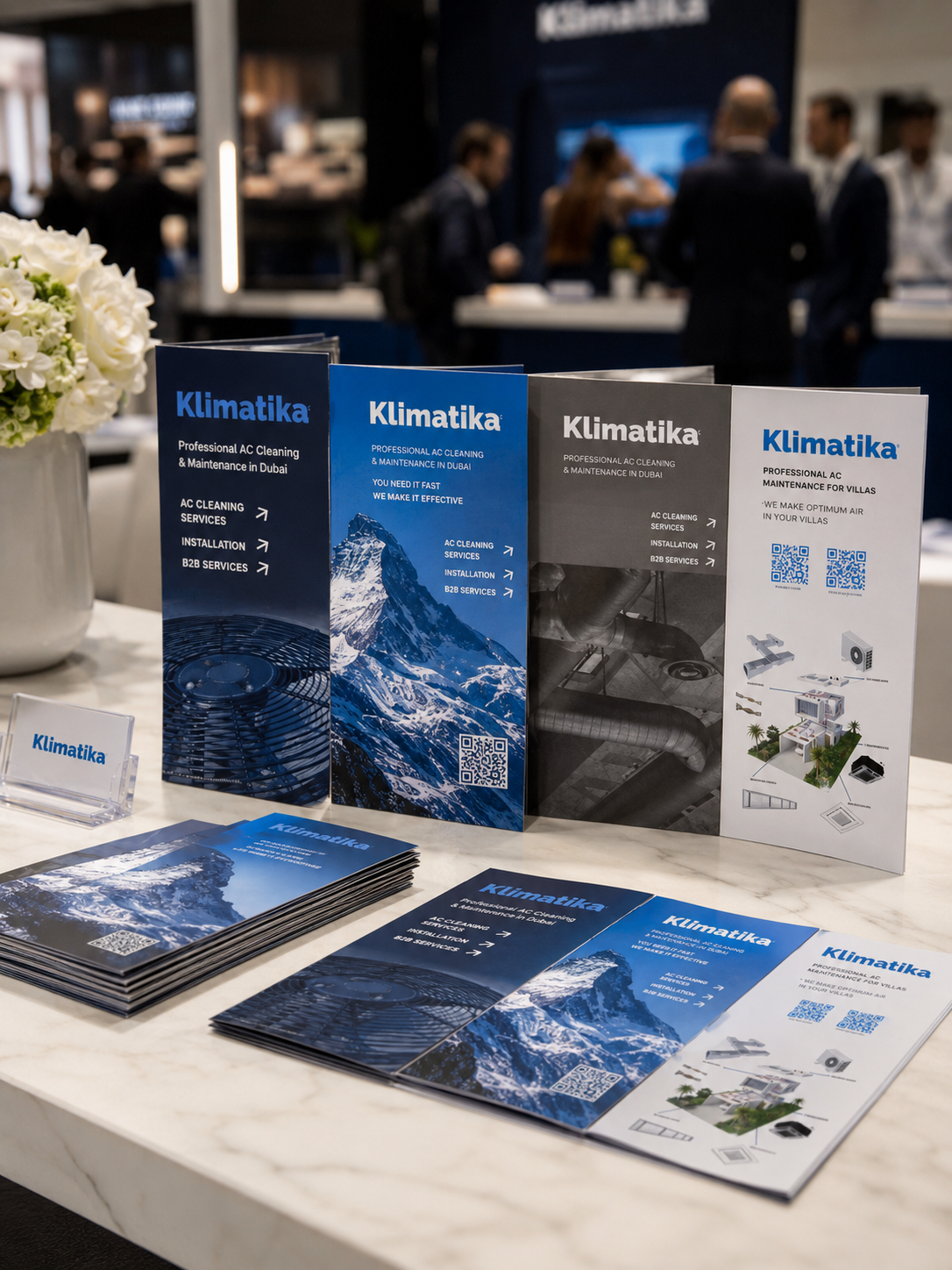
The final presentation remains calm: large images, minimal text, and a clear division of media—from outdoor and roll-up to printed materials.
Brand in use
the brand conveys the meaning of the business

EXPERT
technicality
CLIENTS
priority
TRANSPARENCY
trust
Ready to grow?
Let's discuss the budget, timeframe, and what really works here and now.
Leave a request - I will review the task and suggest a work format