01 / Original Problem
This is how the Bereg project came into being.«
A boutique hotel by the water as a standalone investment product
The task is to determine the optimal development format for the site, develop a business concept, architectural solution, and project brand.
A plot of land near the water without a ready-made food legend
The challenge is to create a product that can be monetized and packaged beautifully.
The solution is the Bereg project, a boutique hotel with architecture, service, and branding
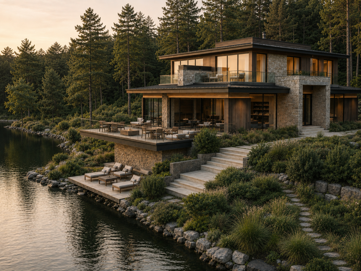
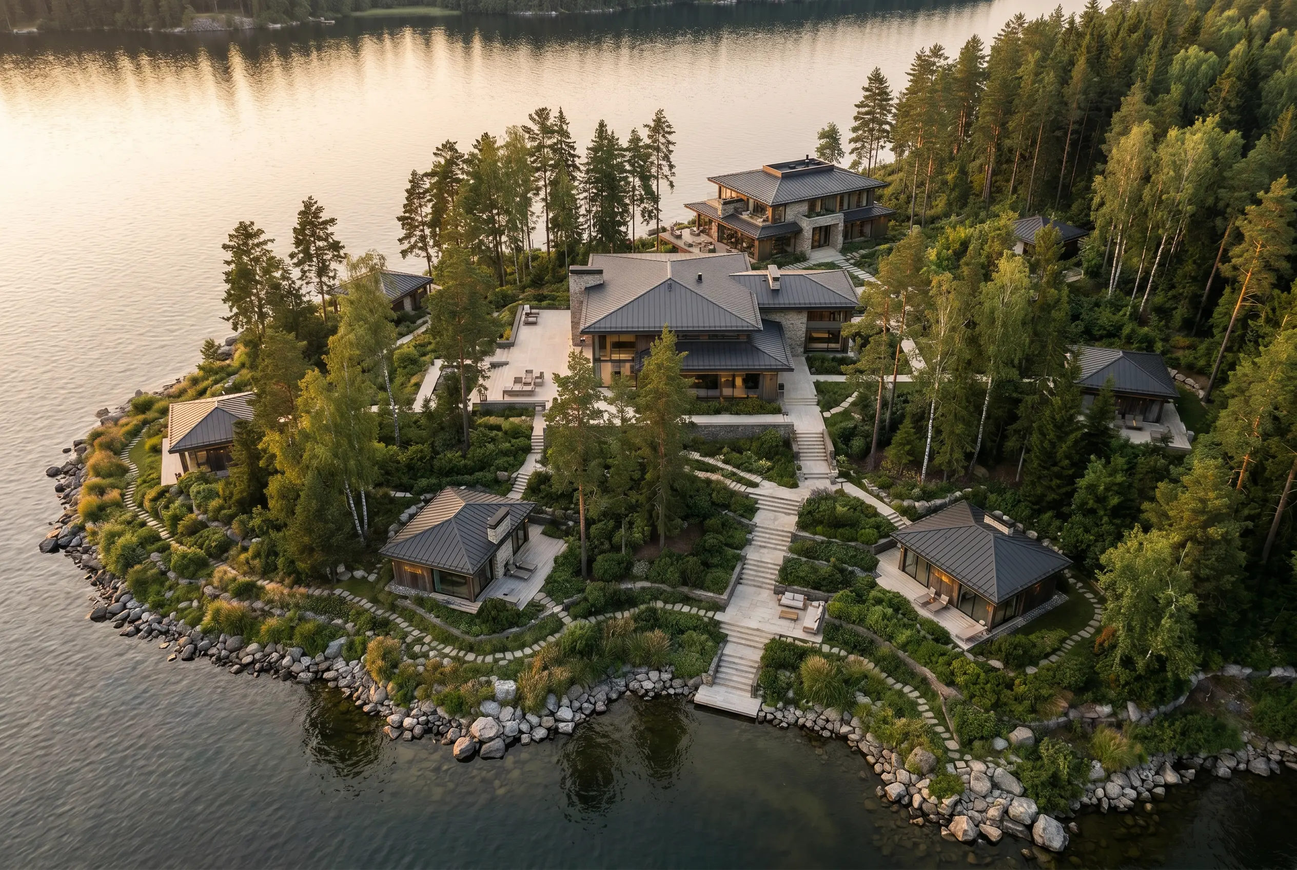
Master plan and business logic
The most effective scenario has been selected
- Three scenarios for the development of the territory have been developed
- A comparison of product logic and option economics was conducted
- A scenario was selected that corresponded to the site's potential and the customer's objectives
- The composition of the objects, areas and sources of revenue have been determined
Concept
3 options at the start
Scenarios based on product composition, investment potential, implementation complexity, and suitability for the task
General plan
Areas and landing
Placement of objects, connections between them, private areas, viewpoints and guest routes
Monetization
3 traffic sources
The hotel, restaurant and villas form separate guest flows and contribute to the overall revenue
Model
Financial audit
Investment, utilisation, revenue, expenses and payback period
Financial model
Evaluation of effectiveness
ROI
Return on investment
IRR
Internal rate of return
NPV
Net present value
02 / Project platform
Project platform
transforms real estate
into the brand
The website's structure, navigation, fonts, and overall style remained unchanged. The final version of the case study reveals the LazyLi brand as a holistic system: audience analysis, concept, product line architecture, packaging, digital, and social media.
Positioning
Intimate wellness retreat by the water
Private service, modern architecture and natural surroundings in one format
Target audience
Wealthy guests who appreciate the peace and aesthetics of restoration
Entrepreneurs, couples, and private guests seeking quality vacations near Moscow
Value
Full recovery in a short trip
Accommodation, dining, wellness and water recreation all in one place
Effect for the project
The project is easier to promote and sell
A clear concept sets it apart from competitors and helps justify the cost of placement.
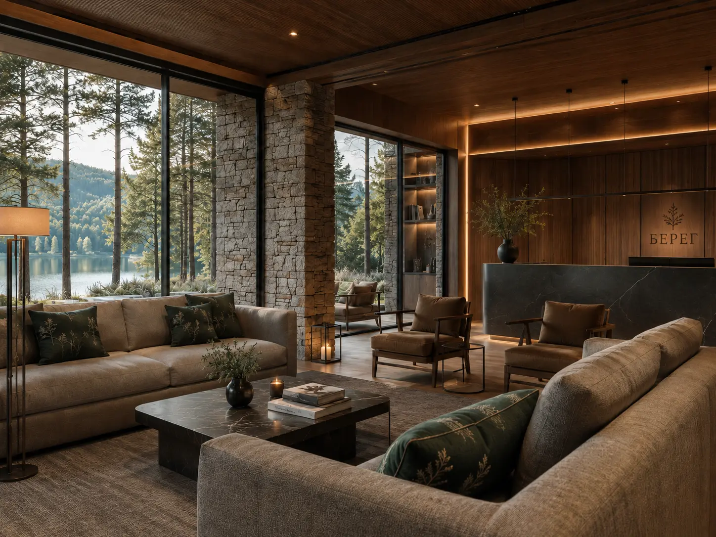
Premium logic
Why is the concept important here, not just the square footage?
01
The property acquires its own history and market positioning
02
The concept increases the perceived value and rarity of the offer
03
The identity and architectural language make the project cohesive at all points of contact.
04
Instead of a typical suburban facility, a full-fledged branded facility is being created
03 / Architectural solutions
Concept, landing on the site and stay scenario
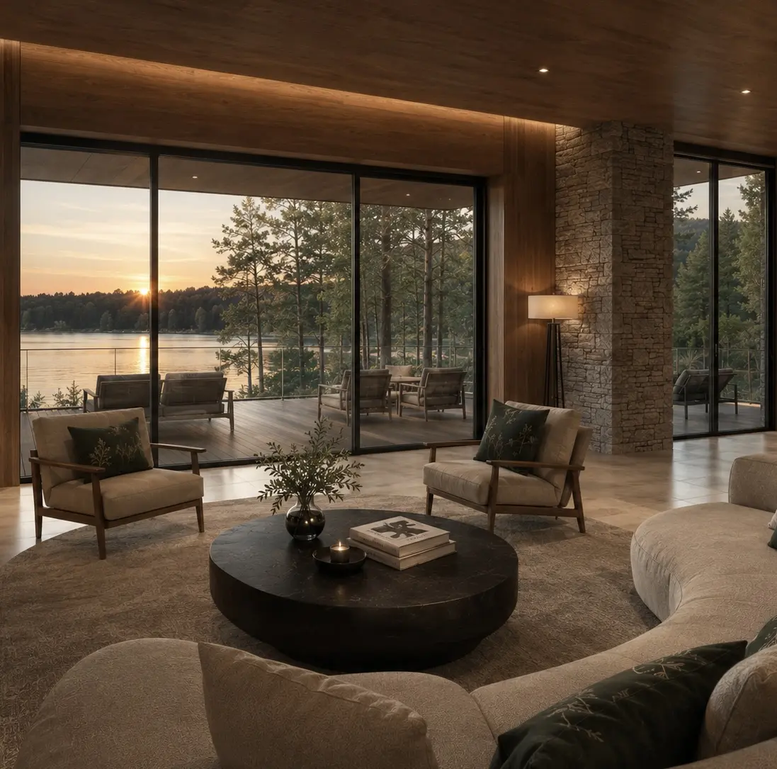
The architectural part emphasizes privacy, seasonality, and contact with the landscape: warm materials, interiors with views, water, forest, and a soft living scenario
Composition of the complex
«"Bereg" is a complex consisting of a boutique hotel, a restaurant, and 8 villas.
The architectural concept brings together several product scenarios into a single system: accommodation, gastronomy, private relaxation, and waterside recreation.
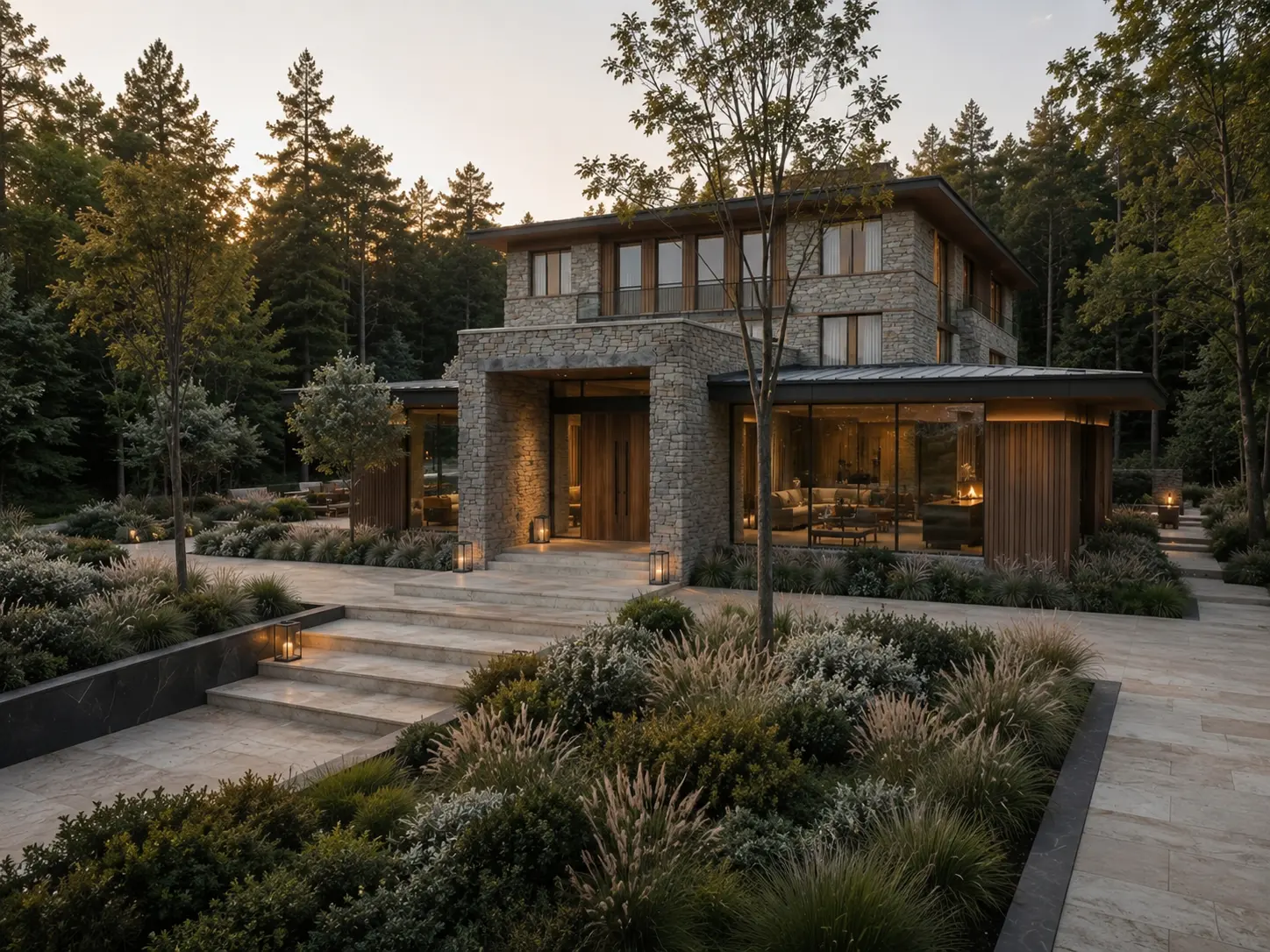
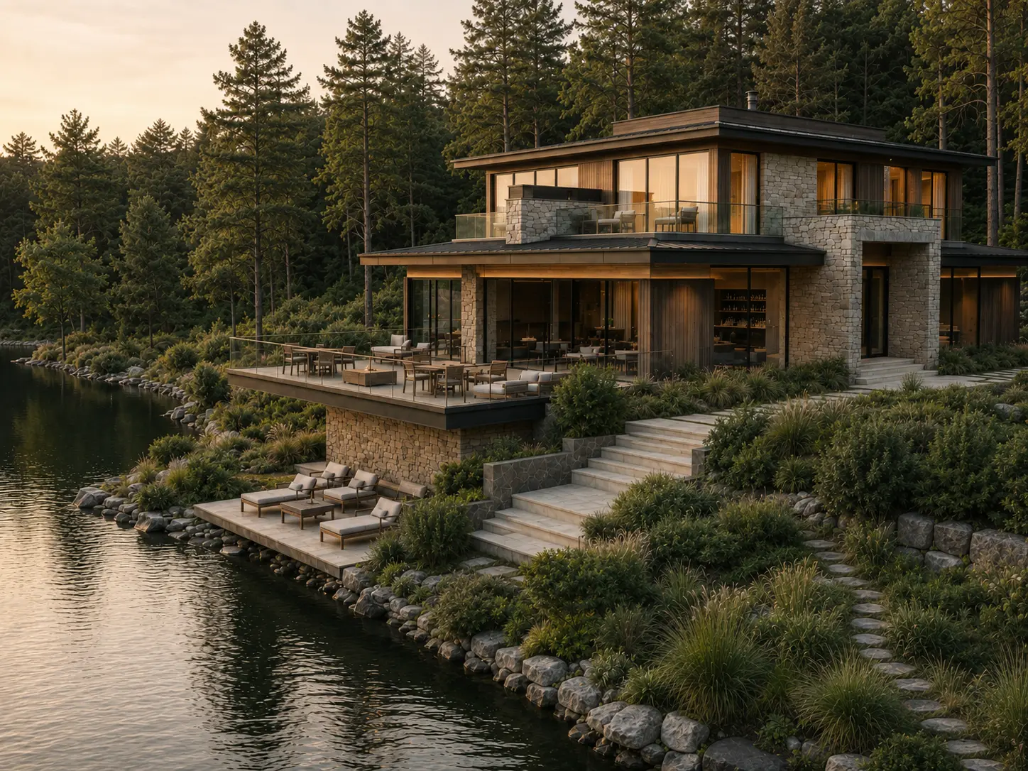
Boutique hotel
The main object and center of the guest scenario
Restaurant
Point of attraction and evening scenario
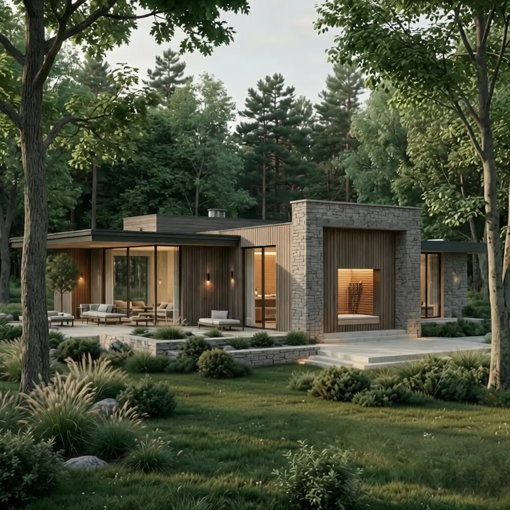
8 villas
Private accommodation for guests who value peace and privacy
Solution
Architectural language
Low, tranquil architecture with tactile materials, panoramic glazing and a sense of shelter by the water
Solution
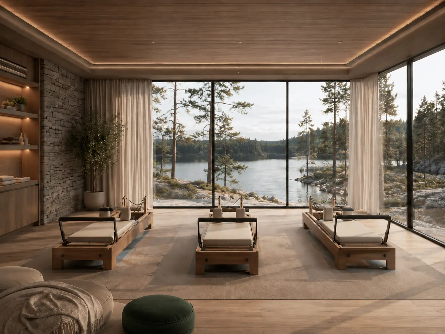
Interior
Low, tranquil architecture with tactile materials, panoramic glazing and a sense of shelter by the water
Solution
Exterior
Low, tranquil architecture with tactile materials, panoramic glazing and a sense of shelter by the water
Seasonality
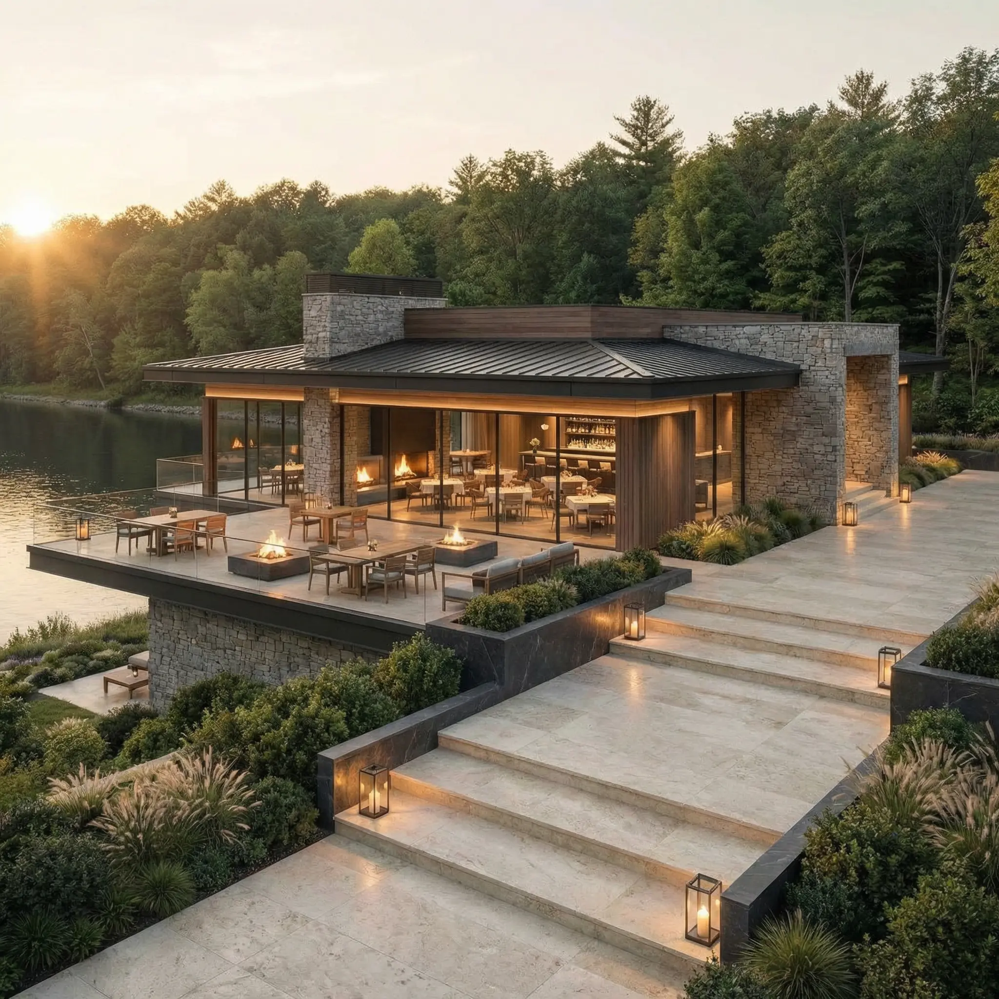
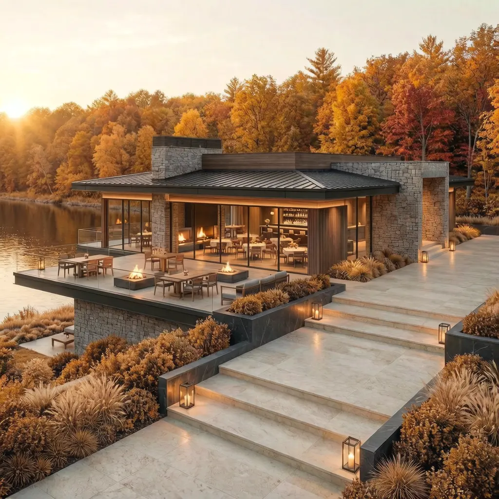
The architecture is designed to be equally expressive in winter, summer and autumn.
Seasonal renderings show that the project is not dependent on a single mood: in winter it becomes intimate and warm, in summer it is open to the water, and in autumn it is especially textured and natural.
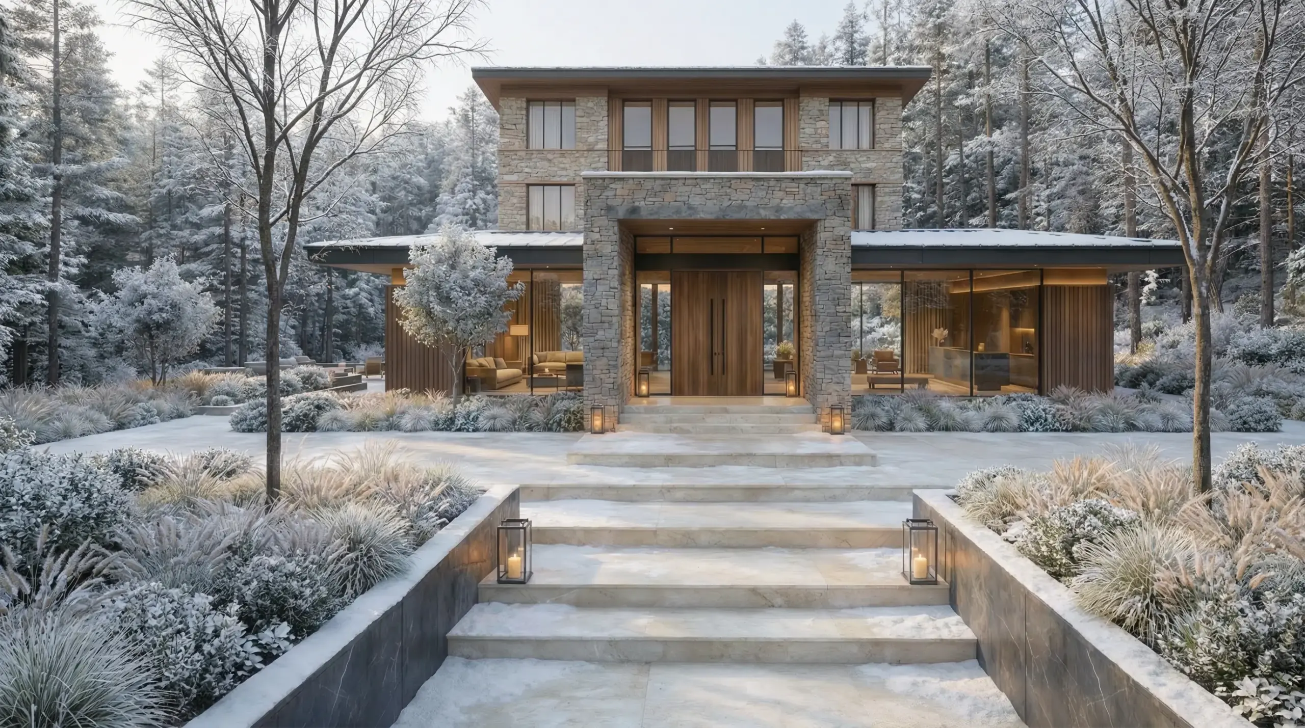
Interiors
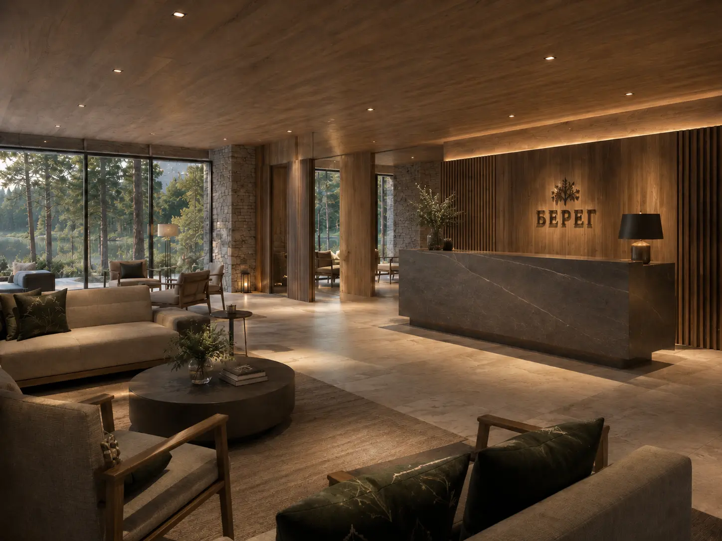
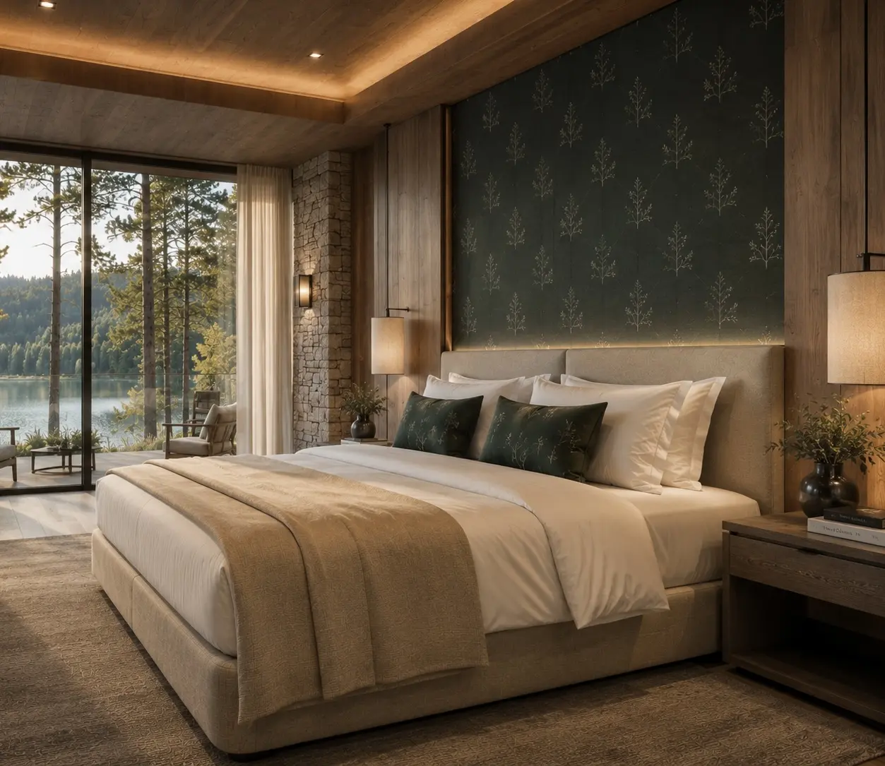
The architecture is designed to be equally expressive in winter, summer and autumn.
Seasonal renderings show that the project is not dependent on a single mood: in winter it becomes intimate and warm, in summer it is open to the water, and in autumn it is especially textured and natural.
04 / Atmospheric Gallery
The architecture and atmosphere of the project read as a sequence of impressions
We collected interior and atmospheric perspectives: water, forest, wellness, tactile materials, and tranquil scenic scenes that support the project's image.
05 / Media
The media shows how the brand lives in service
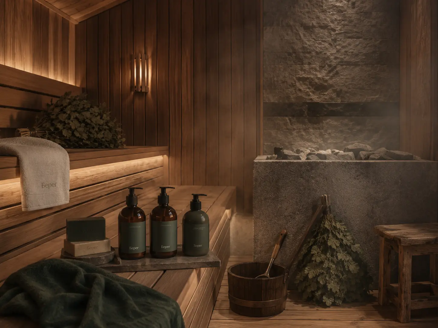
This block is raised higher to immediately show the material embodiment of the brand after the architectural logic: textiles, welcome sets, amenities, tableware, a bath line, and details of the stay.
Premium at the detail level
The key to the villa is in a separate leather card holder.
Even small service elements contribute to the feeling of thoughtful luxury: the card is not lost, does not get dirty, does not hang around in a bag and is perceived as a personal accessory for the guest.
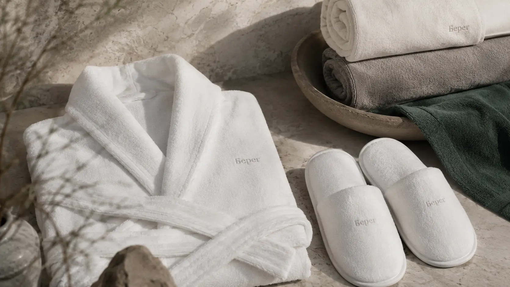
Brand
Robes, slippers, towels
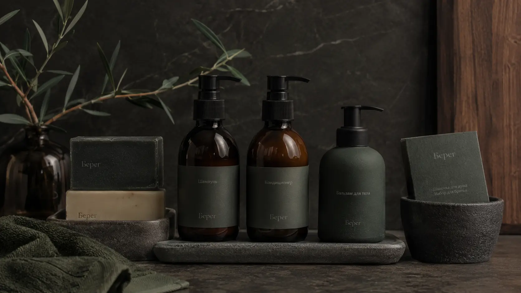
Amenity
Cosmetics, accessories and care
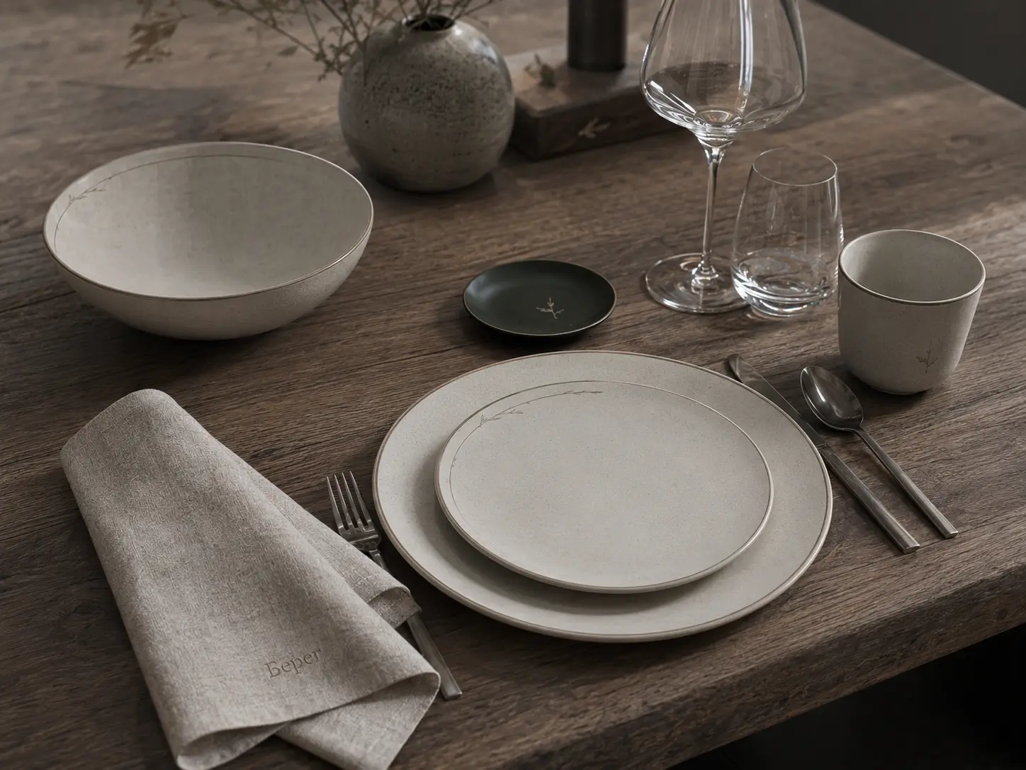
Brand
Details of the Everyday Guest Experience
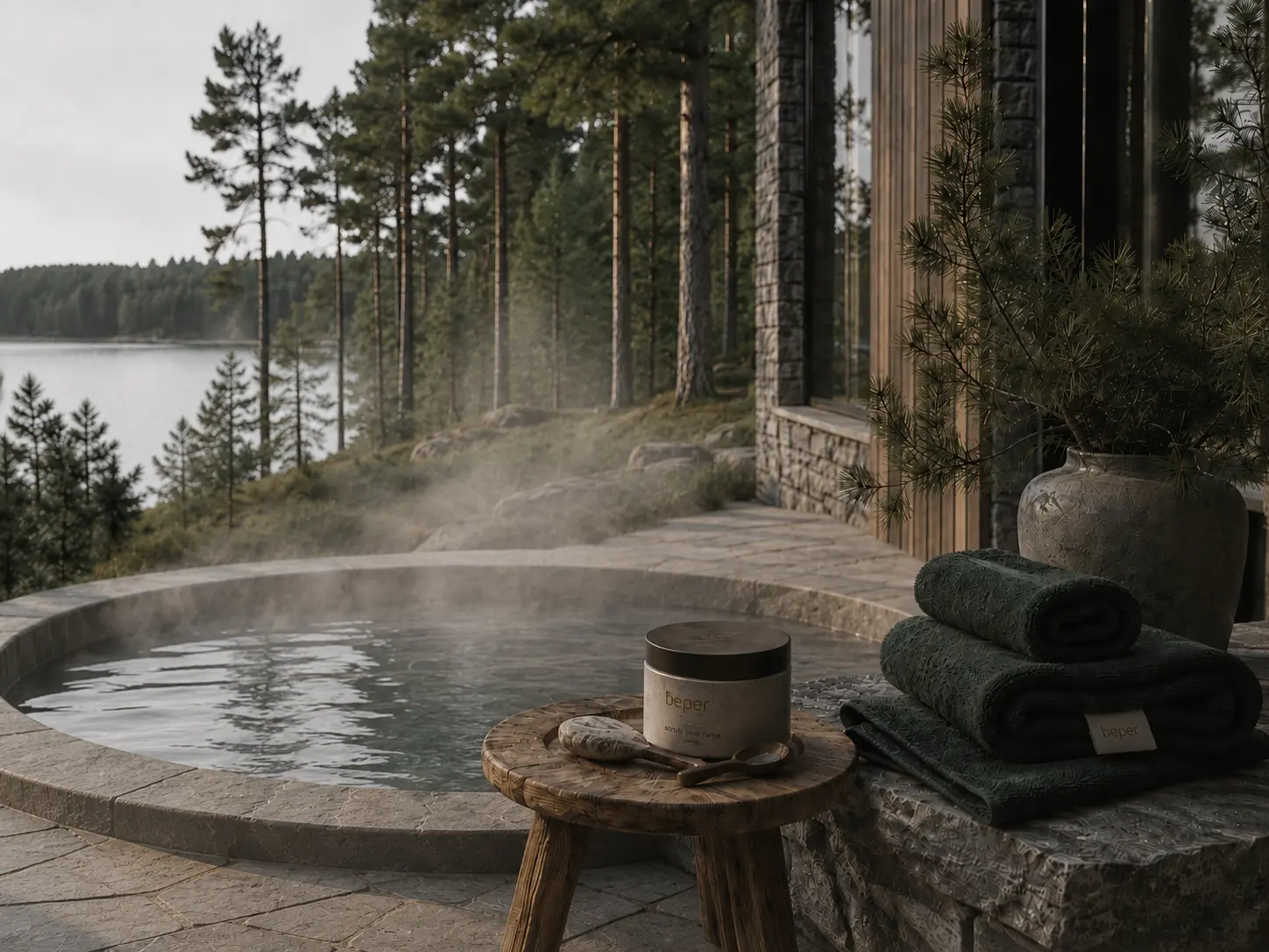
SPA
Font by the water and restoration
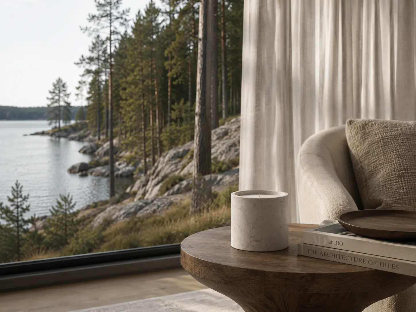
Atmosphere
Relaxing lounge areas and panoramic views
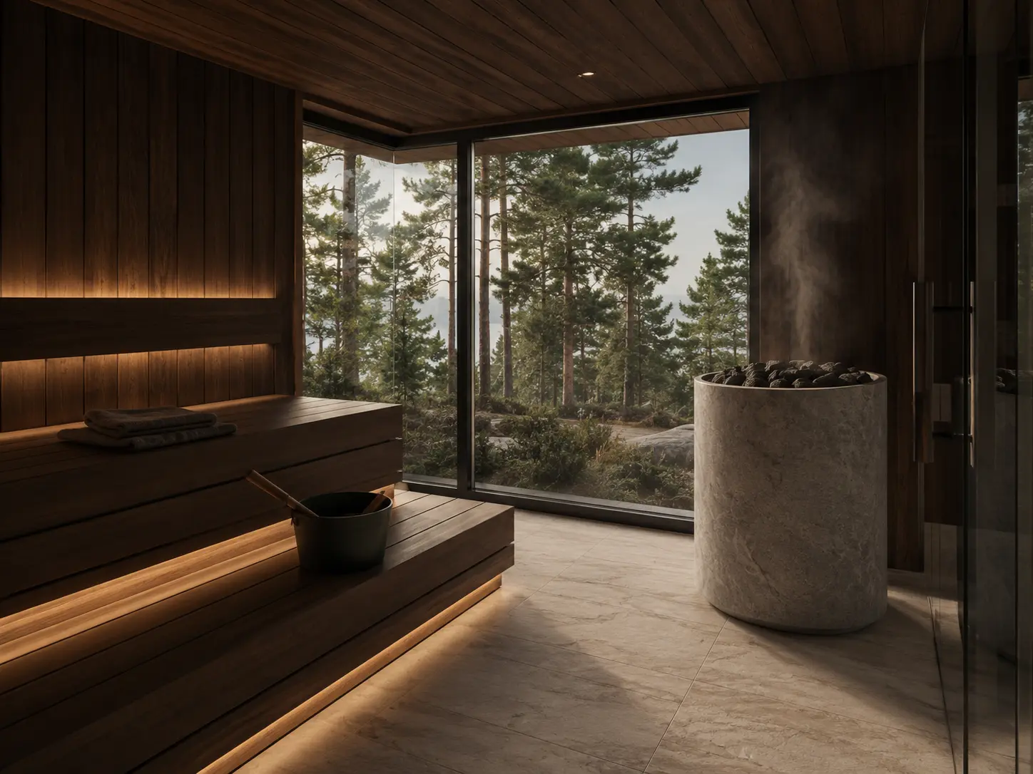
Seasonality of the project
Architecture works beautifully at any time of year.
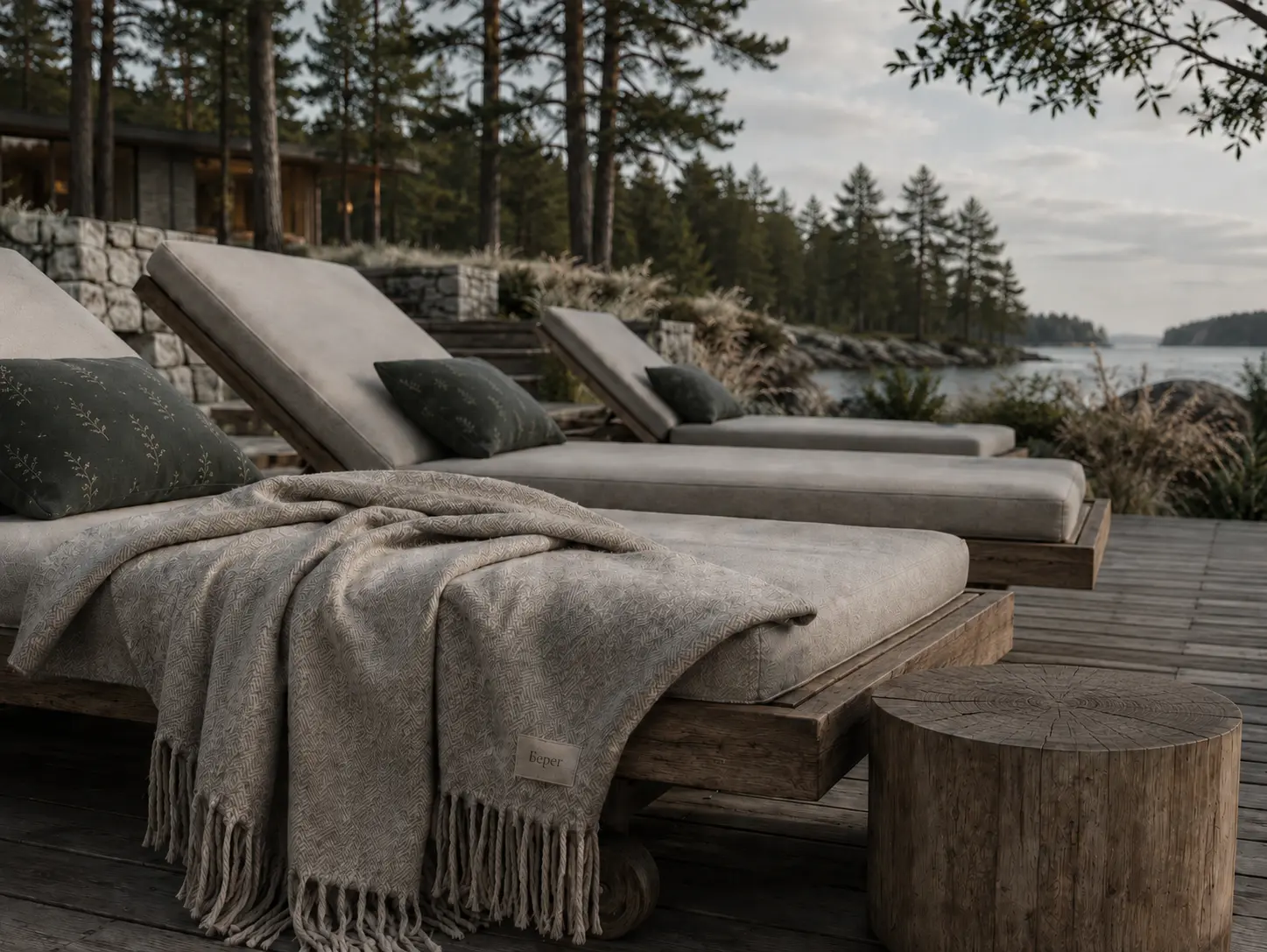
Brand
Pillows, blankets and tactile details
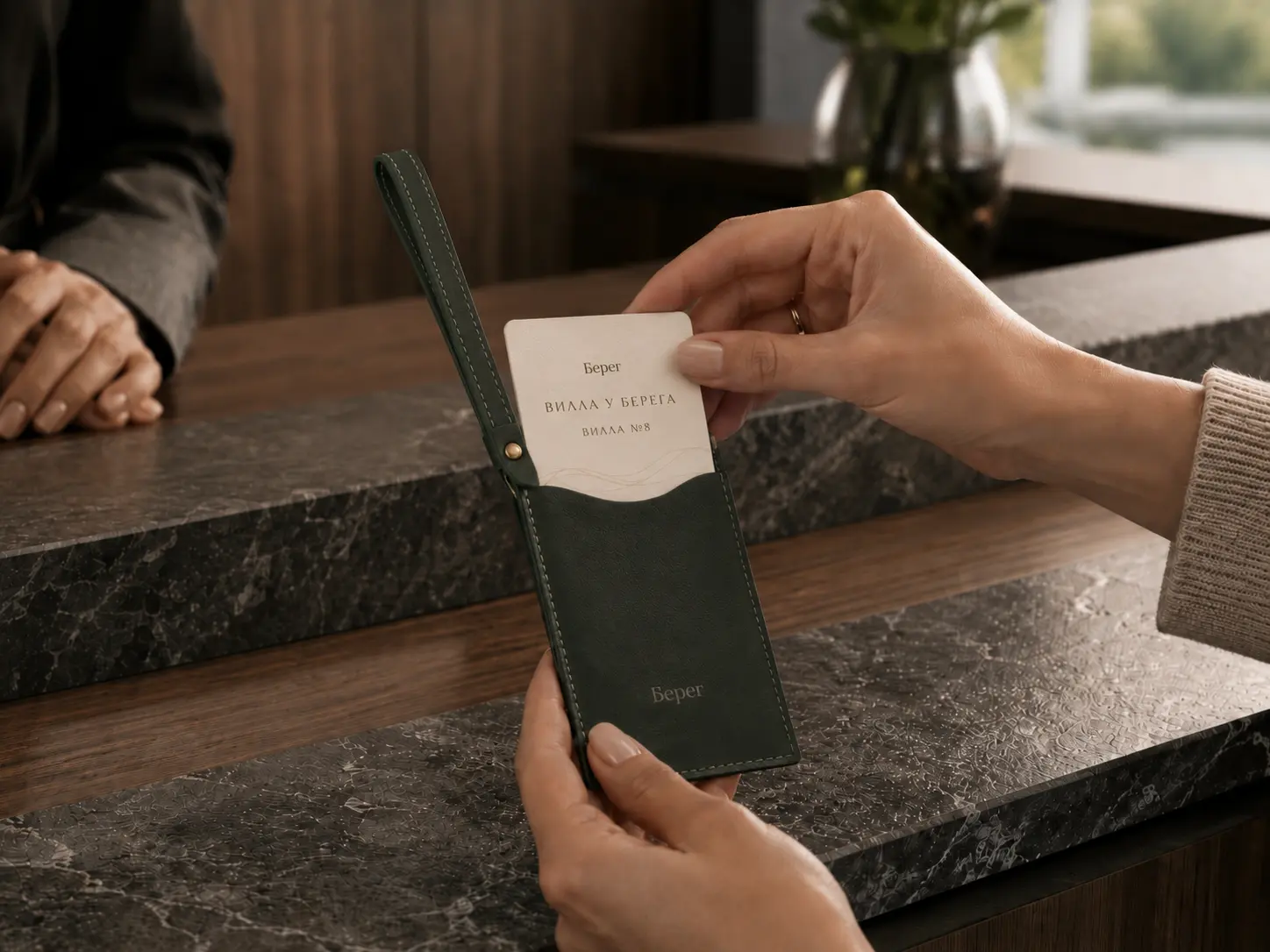
Key and card holder
A personal accessory that never gets lost
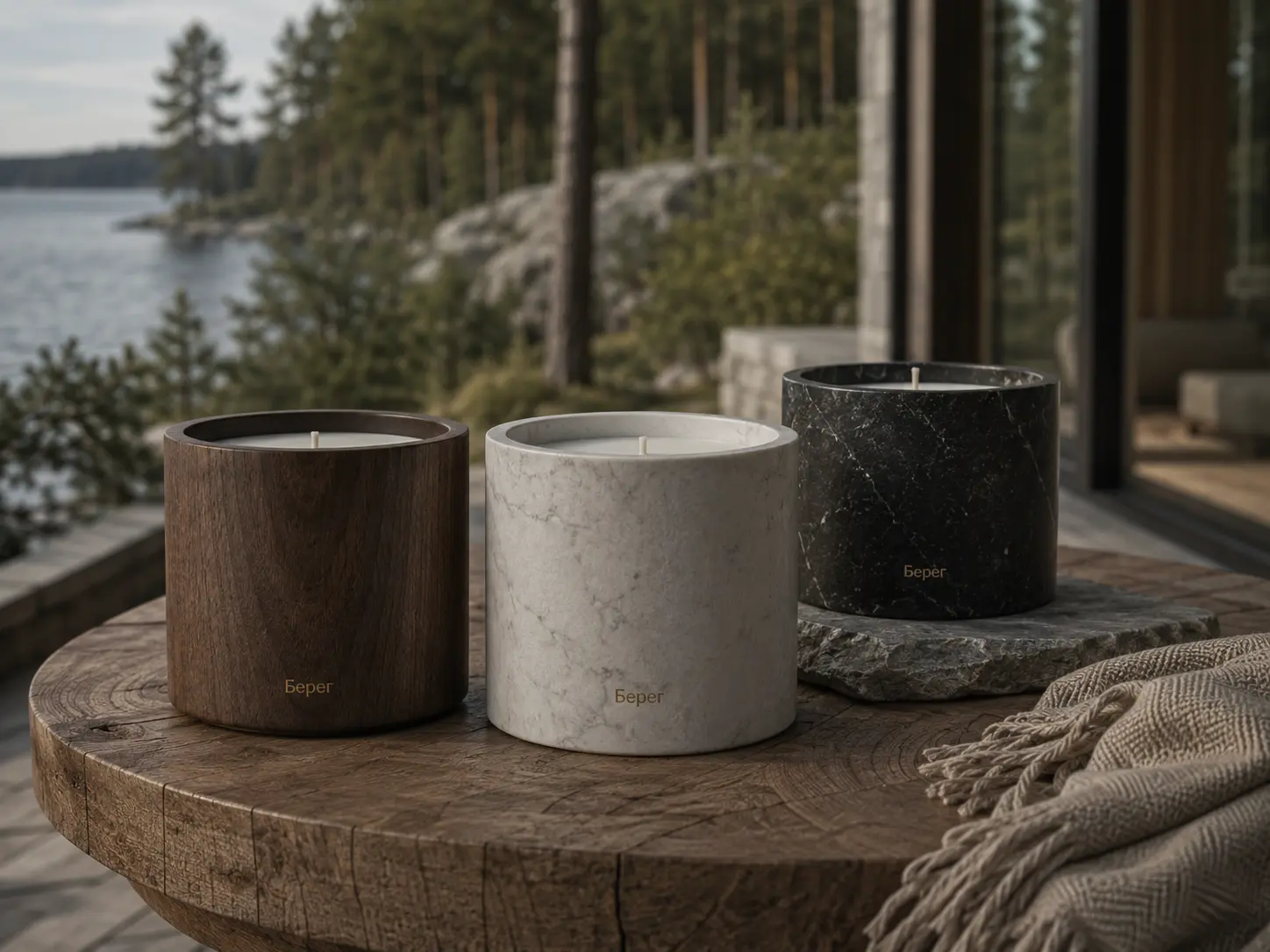
Object ritual
Luxurious materials and details
Sport
Variety of fitness and relaxation
06 / Identity and palette
The identity and palette unite the project into a unified brand
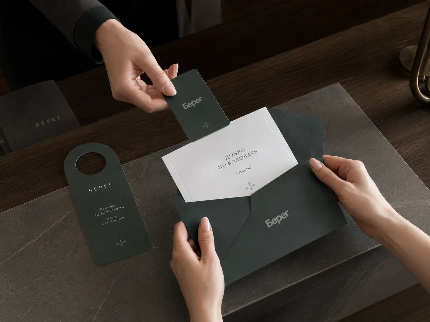
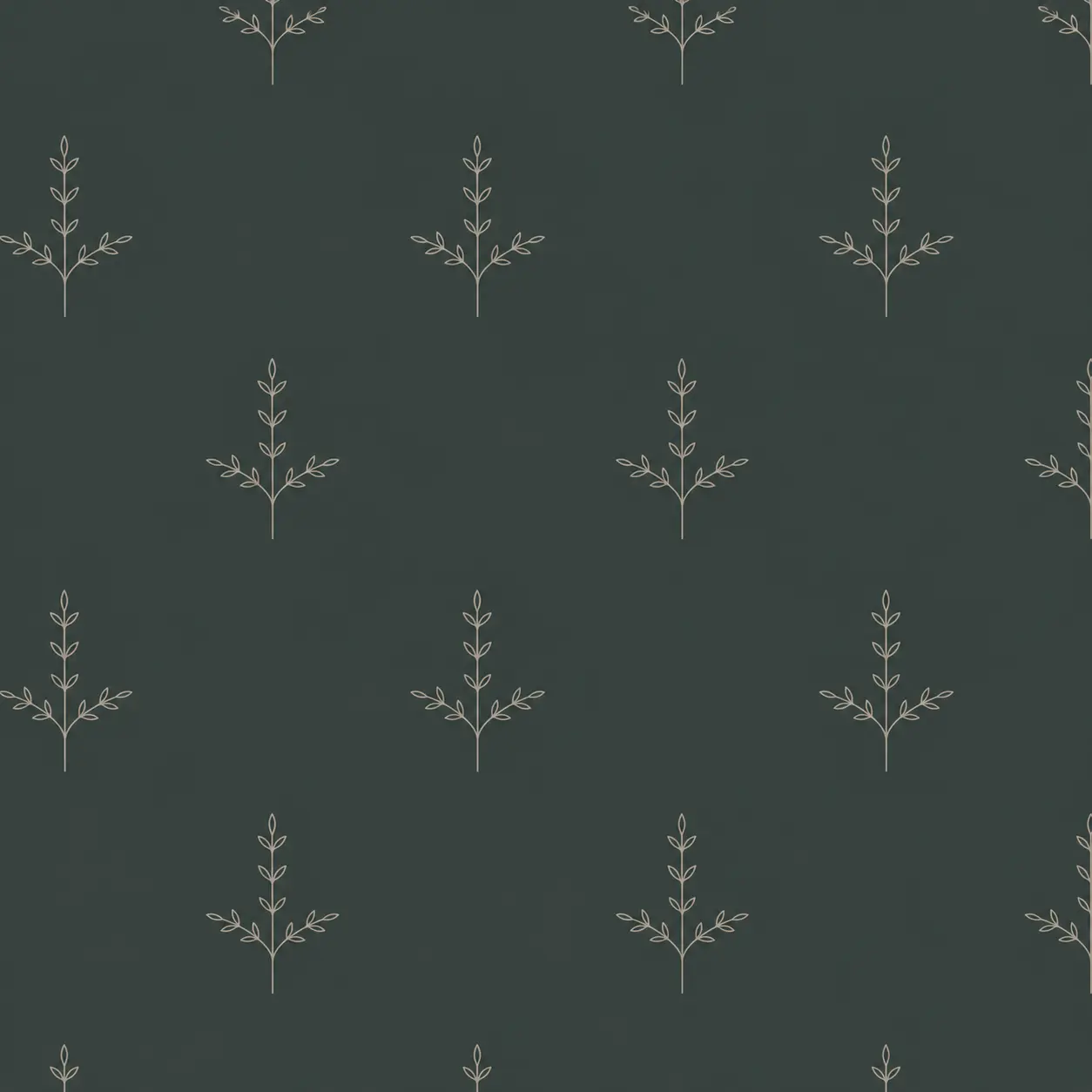
The palette is integrated into the identity and demonstrates how color, graphics, and materials work for the brand in real-world media: welcome communications, key cards, printed and tactile details.
Shore
The logo functions as a calm signature for the project. It supports the architectural character: a long horizontal line, a sparse rhythm, and a sense of confident silence.


Character
A minimalist logo-inscription without decoration is the visual equivalent of heavy luxury
Usage
Works best on light backgrounds, in navigation, guest media, and tactile materials.
System
The "B" monogram is used where a compact sign is needed: accessories, tags, key cards and digital icons.
Deep Forest
#2F433D
Cold Walnut
#5A4F49
Stone Gray
#BCC4CB
Slate
#6C737B
06 / Brand Guide
The brand system continues the architecture in service and details
The media is designed as part of the guest experience: not a standalone decoration, but a thoughtful system that supports the feeling of a rare, private, and cohesive place.
From robes and towels to a beach bag and key card, each piece contributes to the project's image.
The branding remains quiet and subtle: the large logo is used sparingly, and the monogram and color palette create recognition without visual noise.
01
The textile is white or light grey, with a minimal signature «Bereg» and a monogram «B».
01
Bags and accessories are muted, graphic, and perfect for the spa, beach, pool, and short stays.
01
Printed materials are like a continuation of the architectural plane: a lot of air, calm typography, thick paper.
01
The room's navigation and accessories support its club status and the feeling of attentive, personal service.
Ready to grow?
Need a concept for a development project, land or suburban property?
Leave a request - I will review the task and suggest a work format.